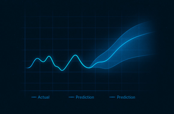
The implementation ranges from simple Excel spreadsheets that monitor key business figures to elaborate Data visualizations with dedicated tools (e.g. Tableau). There are virtually no limits to the display options. Highly individualized and interactive dashboards can be created using a variety of chart types, maps and filter options. Complex issues and correlations can be presented to the viewer in a targeted and informative way. This high level of insight into the data enables decision-makers in companies to find answers to specific questions and make the best possible decisions based on them.
But why do we visualize data in the first place? To analyze problems and situations - it's about building an understanding of a situation and deriving suitable alternative courses of action. Dashboards often highlight monetary key figures, or key figures that at least have an impact on monetary values. One dashboard even had the superpower of saving lives...
The cholera outbreak and how the collection of data saved the first lives
Soho (London) 1854, a cholera epidemic has the world firmly in its grip. The physician John Snow has been researching cholera here for years. And he has a hunch: Snow assumes that it is a bacterially transmitted disease, for example via water. However, hardly anyone wants to believe him. The concept of diseases transmitted by bacteria was not known at the time. Instead, people believed in a miasma, a disease-causing substance created by putrid processes in the air and water. The city was completely overcrowded, faeces were simply poured onto the streets - a perfect breeding ground for disease.
When a baby at 40 Broad Street falls ill with cholera at the end of August, it is certain that the epidemic has also reached Soho. Within a few days, over 600 people die of the disease. John Snow senses his chance to convince the world of his hypothesis. He goes to Broad Street and starts collecting data on deaths by interviewing survivors, residents and relatives of the victims. One thing strikes him: Many of the sick had previously drunk from the same well. However, the well water did not have a bad taste and a water sample taken also appeared to be "clean". On the evening of September 7, 1854, Snow visited the city authorities and recommended that the fountain be closed immediately. They complied with his request and removed the lever on the water pump.
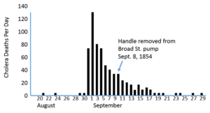
A dashboard sets a milestone in epidemiology
As it later turned out, faeces contaminated with cholera bacteria had seeped into the well water due to a construction error. And even though the local outbreak was contained by closing the well, the public still doesn't believe Snow's theory. But Snow has an idea. He consults another source of data: acquaintances who live and grew up in Soho can identify which deceased person lived where. This enables him to map the deaths with locations and mark them on a map.
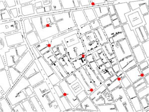
He also draws all the fountains in the surrounding area (red circle) and the fountain in Broad Street (red cross). Based on distances and accessibility from various streets, Snow then delineates an area in which the fountain in Broad Street is the closest or most easily accessible.
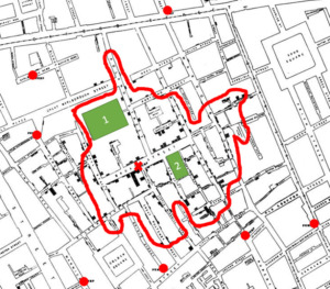
Through this type of visualization, Snow can already counteract the theory of the miasma, as it supposedly appears in the form of a cloud. This means that the deaths should be distributed across the city like a cloud. However, it is clear from this form of representation that the number of deaths is linked to the location of the fountain. However, the map also shows outliers in the data. These threaten to invalidate Snow's own theory. There were hardly any cases of cholera at the House of Labor (green 1), a social institution, and the brewery (green 2), even though these are in the immediate vicinity of the well. There were also two deaths from cholera in a district of London further out. So Snow investigates. It soon transpires that the work house has its own water source. As a result, hardly anyone had drunk from the well in Broad Street. In the case of the brewery, the low number of cases can be explained by the beer. The employees drank almost exclusively the beer produced there during their working hours and were therefore largely spared from the epidemic. In the case of the two deaths outside Soho, it was quickly established that they had previously been visited by a family member from Broad Street who had the contaminated water with them. By explaining the outliers in the data, Snow can invalidate them as a counter-argument to his hypothesis and at the same time further support his own theory.
With his valuable findings, Snow was not only able to save many lives in the short term, but also set a milestone in epidemiology. Away from the myth of the miasma towards an understanding of viruses, bacteria and the importance of hygiene in the containment of diseases.
Dashboard then and now: what else can we learn?
History shows us that it is not only important to collect data. Added value is only created when this data is visualized in a form that is easy to read and interpret. The correctly chosen representation makes it possible to build up a certain understanding and recognize patterns. This slight adjustment transforms a poorly legible data set into an intuitively understandable map and makes the problem tangible.
In most cases, a data set can be presented in many different ways. Depending on the chosen form of presentation, different key figures, ratios and patterns can be read out more or less clearly. When choosing a chart type, you need to be clear about which data and dependencies you want to highlight for which purpose and which questions you ultimately want to answer with it.
One example of this is the use of a pie chart. It has been proven that the human brain is much better at comparing lengths than angles. Such a diagram would be a suitable form of representation if a data set contains few categories and you want to know how large the proportion of a category is in the total. If, on the other hand, you want to compare specific values with each other, it is advisable to use a bar chart. Depending on the use case, you would prefer stacked bars, overlapping bars or one of the many other variations. Other important factors in the presentation are the colors used and the general structure of the dashboard. The visualization should remain as simple as possible and not be overloaded with too much information. Otherwise, the viewer could lose sight of the essentials. In summary, it can be said that the design of the dashboard has a major influence on the quality of decisions based on it. In some cases, a new perspective on the data even enables decision-making.
We also learn from John Snow's story that it is essential to fully understand the data and its context. While the outliers in the map at the beginning still shake his theory, the explanation of these leads to the strengthening of his own hypothesis. It is always worth taking a close look at outliers. At best, these can be easily explained. However, you can also identify errors that were overlooked when creating the dashboard.
Another aspect that Snow's dashboard teaches us is the power of good data visualization. Without the map, Snow would never have had the opportunity to convince people of his findings on the epidemic. Applied to the present day, it can be said that it is much easier to communicate facts that are supported by intuitive visualization. This makes it possible to communicate findings and proposals for action to stakeholders in a comprehensible and successful way.
Conclusion - data visualization is not an end in itself
Dashboards can make everyday work much easier for their users. Data can be displayed in countless combinations and variations. However, data visualization is not an end in itself. The focus is always on the actual problem and the resulting question that you want to answer with a dashboard. The cholera outbreak in Broad Street in 1854 provides us with a historical example of this. In this case, everything revolved around the question of how the virus was able to spread locally and what measures could be taken to stop the outbreak. The decisive factor in the presentation of the deaths was not the choice of colors or an animation that made the dashboard appear dynamic. It was the visualization as a map that made it possible to understand the situation on a new level and thus identify the well as the cause of the spread of the epidemic.
Once you have succeeded in clearly formulating the core question of your problem and identifying a suitable form of presentation, nothing stands in the way of a good dashboard.
Want to learn more about good dashboard design? Read our Guide to successful data visualization.