Smart city development concepts aim to make cities more efficient, technologically advanced and greener, among other things.
In this article, I present the interactive and informative visualizations of the dashboard of the Smart City project of the city of Münster.
But first: What is the aim of the Smart City staff unit with this project?
The first priority is to analyze the effectiveness of measures in the urban space on the basis of real-time data and interactive time series. However, private individuals can also take advantage of the informative dashboard. One example: If you wanted to open a store in Münster, you could analyze the data on the number of passers-by in the important districts and make a data-based decision.
Data visualization: Where does the data come from and what data is involved?
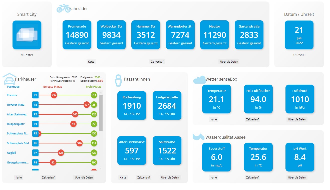
Thanks to a sensor network, which is to be gradually expanded, live data on environmental data (air quality, water quality, temperature) and data on mobility-related data (parking garage utilization, pedestrian frequencies, bicycle counting stations) can be viewed.
The interactive map display provides information on the respective locations of the data collection. Information and contact persons for the individual topics can be found by clicking on "About the data" under the respective topic tile. All data is also available as open data via the Open Data Portal of the City of Münster available for other purposes.
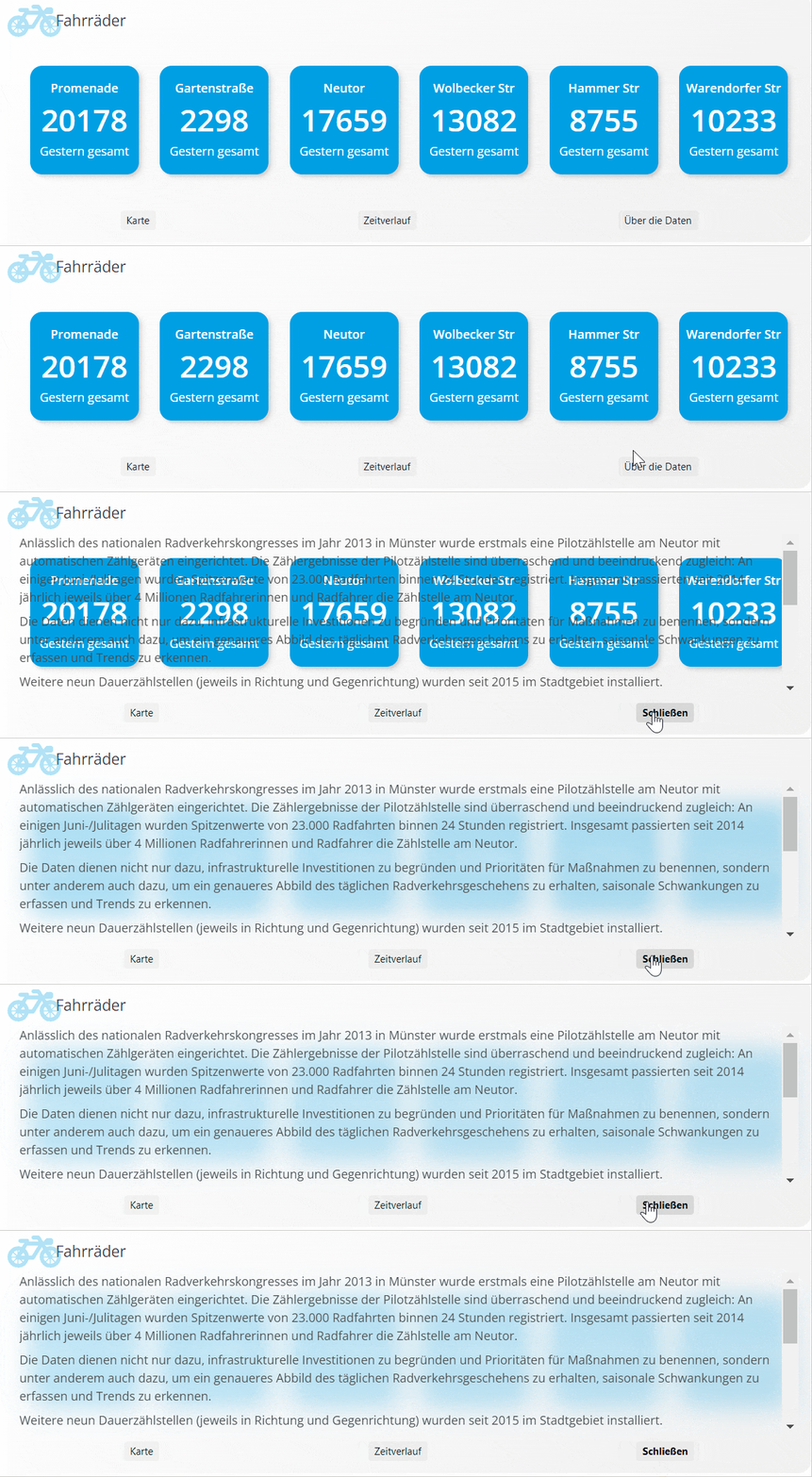
You can find out the best way to gain access to data read here.
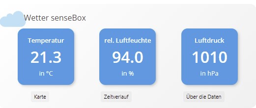
The environmental data is recorded using the senseBox provided by the city of Münster. The senseBox is a small environmental measuring station for the home: various sensors and modules can be connected in a modular system. The data is transferred from the platform "OpenSenseMap" can be called up. There you can find many more sensors in the city of Münster and worldwide. The OpenSenseMap is an open platform for open sensor data in which anyone can participate. The data was visualized using info maps.
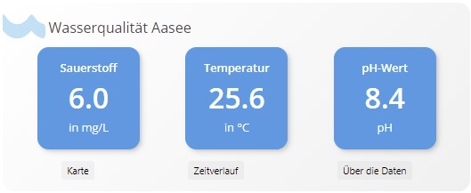
Data regarding the Water quality will be made via Sensors in measuring buoys or buoys in Lake Aasee have been continuously measured since summer 2020. The data collected is transmitted to the relevant authorities in real time via Stadtwerke Münster's LoRaWAN network (Long Range Wide Area Network). LoRaWAN is used specifically for the Internet of Things (IoT) and Industrial Internet of Things (IIoT) and enables energy-efficient transmission of data over long distances. In this way, measures to improve water quality can be taken at an early stage.
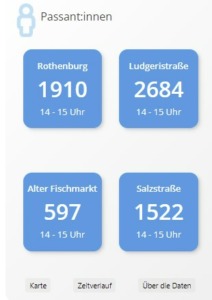
The Passenger:inside frequency is an important indicator of the attractiveness of a city center. Whether retailers, investors, urban planners, traffic planners, retail researchers or city center visitors, a wide range of stakeholders benefit from footfall data. The data is anonymized via Laser scanner collected. The measurement takes place 24 hours a day, 7 days a week.
In the city of Münster there are several Bicycle counting points. The Office for Mobility and Civil Engineering presents the number of cyclists counted daily at the bicycle counting stations in the GIT repository available on a daily basis.
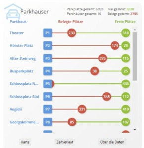
The city of Münster has a modern parking system for better orientation and to avoid traffic searching for parking spaces, Dynamic parking guidance system. Information on the exact location of the larger publicly accessible parking spaces and parking garages is displayed using a bar chart. The bars are visually enhanced by bubbles with numbers of occupied and free spaces.
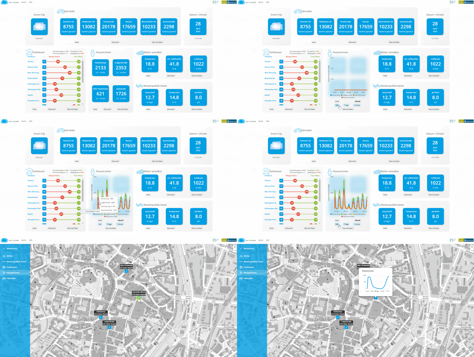
In each area of the dashboard, you have the option of performing an interactive analysis of the time series. This takes you from the info card view to a line chart showing either the current data, the data for the last 24 hours, the last week or the data for the last month. You also have the option of viewing the location of the data sources on a map diagram. In this map view, it is again possible to view the data on a line chart with just one click.
It is not only open data, but also an open source project. The React Project is freely available as free software for adaptation, improvement and distribution: Source code of the front end, source code of the back end.
What went well in this data visualization and what could be optimized?
It is a best practice to inform users about the questions and objectives of the dashboard with a dashboard profile. This dashboard not only provides information about the overall dashboard with the help of an info button, but also provides additional information about the respective data for each KPI area.
Furthermore, each diagram has a descriptive name, which is also a must and has been done well here.
The type of diagrams has been chosen correctly, as line diagrams are ideal for visualizing the course of time. The info card view makes it possible to display the live data without a lot of frills with large numbers. This allows you to concentrate on the essentials. There is plenty of white space and clear, bold data. Displaying the data in this way helps users to recognize the relevant points at a glance. All in all, the dashboard with its charts has a modern, clear design. If a chart is provided with shapes, colors, with a layout that looks nice and appealing, the eyes automatically stick to it. A user is more likely to go to a data visualization if it is appealing to him.
Attention was also paid to small details in the color selection, for example, the temperature in the weather and water quality has the same color in the time history view. In this view, the dashboard developer has also given some thought to the filter selection. To promote clarity and interactivity, you have the option of filtering only by the streets you are interested in.
The fact that users are provided with information about the current status of the data is also positive. It helps users to assess whether the information displayed is reliable.
On the other hand, the dashboard presented in this article could be optimized in a few aspects. For example, no attention was paid to red-green blindness when selecting the colors for the visualizations. Those affected have a weaker vision of red or green and therefore have difficulty distinguishing between the two colors and interpreting the data.
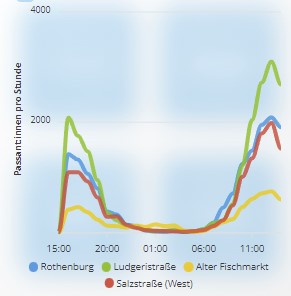
It would also be more user-friendly if filters were available for the entire dashboard, instead of current, 24 hours, 7 days, 1 month, so that correlations can be determined with one click. As the filter option for the last 24 hours is missing in the 'Bikes' section, only the filter options '7 days' and '1 month' would currently be possible for cross-dashboard filtering.
Although the info map view was optimally selected, it would reach its limits when monitoring several locations. However, this problem can be solved very quickly with a scrolling solution, as in the 'Parking garages' section. This problem could also be the reason why there is a difference in the number of data points in the weather data between the map view and the normal dashboard view. In the dashboard view, the data points 'Illuminance', 'UV intensity', 'PM10' and 'PM2.5' are missing.
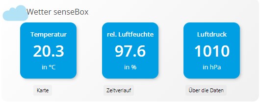
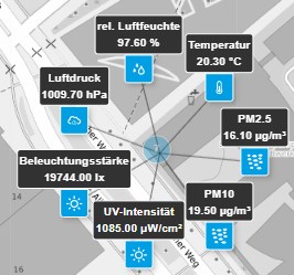
With the help of the proposed scroll solution, all data points in the dashboard view could each be supplemented with an info card visualization. In this way, values such as 'PM10' could be defined with an optional info button in the info card. This would ensure that users of the dashboard understand all the data.
In order for users to make a data-driven decision, a reference point is needed that indicates whether the characteristic of the key figure is good or bad. This reference point is currently missing in the visualizations. For example, threshold values for water quality could be defined and displayed in the line diagrams.
Currently, mobility-specific data is only available on bicycles and parking garages. In future, car use in the city could also be monitored. The number of people commuting by public transport could also be analyzed so that appropriate decisions can be made. Certain services that are not used as much could be reduced, which could lead to a "greener" smart city.
Conclusion: The example of the Smart City Münster shows that good data visualization has great potential for data-based decisions
In summary, it can be said that a look at this modern dashboard definitely leaves a positive impression. The amount of freely available data has been optimally presented with this solution. The ability to monitor the data on the timeline can be a support in decision-making, and not only in decisions regarding urban development, but also in private matters. Imagine you want to go shopping, but you don't like it when it's very busy. Just take a look at this dashboard and you'll know when it's worth going and where you could park.
But what does this dashboard have to do with doubleSlash? This type of interactive visualization can also be used in other areas and industries in which we at doubleSlash are active. For example, large amounts of data from networked machines, from which it is not easy to recognize patterns or anomalies, can be displayed with such dashboards. Only through data visualization and in connection with e.g. environmental factors reveal anomalies - such as exceeding a threshold value. This could be illustrated with charts from this dashboard. The product manager could look for Analysis of the visualizations act faster and more effectively.