The issue of data manipulation is becoming more important than ever. Everyone now uses the Data visualizationto back up his arguments. A prominent example is Robert Habeck, when he presented his Opening balance sheet on climate protection presented.
Creating a data visualization, whether in the context of a dashboard or a single visualization, sometimes works well and sometimes less well. This can happen both intentionally and unintentionally. A negative example of this is the 2020 US elections: some media and certain Candidates have knowingly Data manipulated or visualizations in such a way that a certain opinion is suggested to readers.
It shows us the power of data and how important it is to present and interpret it correctly. In our blog series, we want to address precisely these two topics. Today's topic: What do you need to pay attention to when creating visualizations?
Create visualizations correctly
What needs to be taken into account when creating a diagram? We will show you using various examples.
The axles
The axes are the easiest way to influence the reader's perception. Even if the diagram then looks more attractive and you only look at the period where you think it is most important, you should avoid such steps. Exceptions are here:
- if the diagram or dashboard is only used by very few people and
- when it is pointed out that you are not looking at all the data.
For example: The average price of gasoline in cents per year in Germany
The actual representation would be as follows:
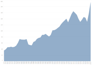
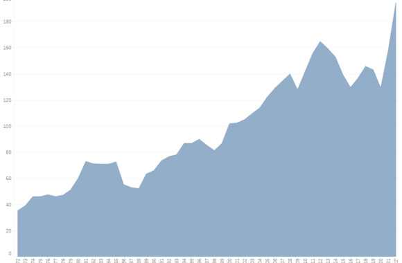
You can see that the price has grown steadily since 1972 - with several ups and downs.
Now you could make various statements and thus influence the reader.
One possible answer would be, for example: Prices have tended to fall in recent years.
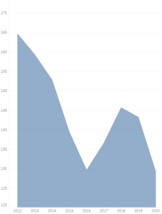
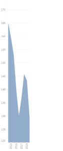
If I only look at the years 2012 - 2020 and deliberately leave out the last two years, this is even true. In this case, both axes were restricted and only a small section was considered. If the X-axis is now compressed, you get an even more convincing result. However, the fact that prices have risen comparatively more than they have fallen is concealed by such a view.
The average
The average is also very dangerous. You can look at two different averages, the arithmetic mean and the median.
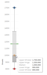
The arithmetic mean (green line), the average value is calculated, e.g. total sales / number of locations. The problem here is that most of the turnover may be generated by the location A has made, location B only a very small and location C an even lower one. This information is lost with the arithmetic mean. The median looks at which location is exactly in the middle of the turnover. One location then generates more turnover than the median and the second less than the median. (Info box)
By using the arithmetic mean, I suggest to my customer that all my locations are generating good sales. The fact that location A accounts for the largest share of sales is lost in this average.
This makes the presentation of such values all the more important. Because even the median figure of 1,000,000 doesn't really tell me much about the situation.
The boxplot diagram is one way of displaying the data. It summarizes all locations in one diagram and shows the distribution of all locations.
Data basis and its confounding factors
There are various confounding factors that influence the data but cannot be explicitly taken into account in a statistic.
For example: The death rate of two cities. City A has a higher death rate than city B.
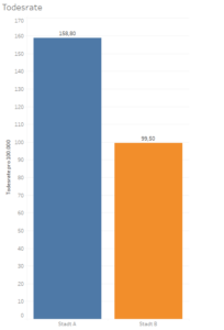
At first glance, it looks logical and the choice of living location would probably fall on city B. Let's take a closer look at the data:

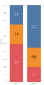
Age can be identified as a disruptive factor here. City A has a much higher number of older people than city B. The probability of death for older people is naturally higher than for young people. This confounding factor distorts the overall mortality rate in such a way that it provides completely opposite findings to the death rate by age group.
So what to do?
For smaller amounts of data, you could integrate a classic table into the dashboard, as in the example here. However, this becomes a problem with larger quantities.
There are three options for this:
- If you have no influence on the data collection, you should also include the absolute figures in addition to the percentages. Either by means of an extra diagram or by integrating them into the existing diagram.
- Randomization: Here the test subjects are selected purely at random, so it may be that confounding factors have less influence if the test group is large enough.
- Inclusion and exclusion criteria: This method determines which criteria are excluded from the study or which group of test subjects is considered.
- Matching: When matching, you only compare values with each other that have the same value for the confounding factor. For example, a 19-year-old woman from test group 1 would be compared with a 19-year-old woman from test group 2, thus eliminating 2 confounding factors (age and gender).
No matter how you proceed in the end, pay attention to where you get your data from and always indicate the source of the data.
As the creator of a diagram or dashboard, it is your task to verify the source data and check it for accuracy. You can also use other sources for this purpose.
Share vs. absolute
Shares do not always tell the whole truth. To ensure that nothing false is conveyed to the reader, you should always consider all factors and highlight them in the dashboard.
Another example of this is the energy expenditure of various households. (low & high earners, average)
In the first diagram we see that high earners spend only a small proportion of their net income on housing energy and the largest proportion is spent by low earners.
However, if you add the absolute figures, you get a different view of the data. Of course, low-income earners are still burdened the most in relation to their net income.
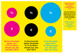
For this reason, it is important that both values are always considered when creating dashboards or diagrams. So that you can assign the proportion correctly.
Comparison of data
It is dangerous to compare data that doesn't actually make sense and possibly even put it into perspective.
Here is an example: CO2 emissions per person in different countries.
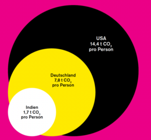
Germany had CO2 emissions of 644.1 million tons in 2019. That's 7.8 tons per person. The whole thing was compared with India and the USA. Now we can consider whether this is really the right basis for comparison. Doesn't it make more sense to compare Germany with France or another neighboring country? You should be aware of these questions when building such dashboards.
Data can be "manipulated" quickly, whether intentionally or unintentionally. This makes the task of the creator of a dashboard or diagram all the more important. They are responsible for packaging data in such a way that a reader receives all the necessary information without losing any of it.
Unfortunately, this is not always so easy in today's fast-moving world. Most people don't want to read long texts to get information, but want to have it at a glance without having to question it. This makes it all the more important to consider what you want to say with your dashboard or diagram and how it will be received by the reader.