Data provided in the company often leads to a colorful bouquet of reports for every question and design requirement. Every report and every key figure requires effort in quality assurance and maintenance, which is why a Regular revision from a professional and technical point of view.
Many wishes - what makes sense?
Hunger comes with eating. In a figurative sense, data projects are no different. The first questions are answered, the users are happy and tell others about it. It is not uncommon to find users who are particularly enthusiastic. They start preparing data and creating reports themselves. Or the advertising drum causes more and more stakeholders to formulate questions and have them developed. That's always great to see! Sometimes, however, this leads to a point where you realize that things can't go on like this.
The right granularity in visualization
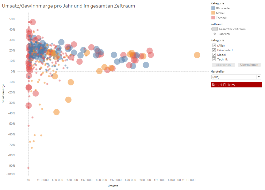
Especially in the area of visualization, we sometimes get bogged down in fulfilling the requirements. Non-existent functions in the tool are replaced by workarounds. An abundance of Filter options is applied at various points and plenty of technical logic converted into calculations. This can lead to poor performance of the reports and to high expenses in the maintenance of the reports. Answers to users' questions about how the data in the dashboard is generated in detail also prove to be time-consuming. What can we do?
First of all, it helps, all reports to go through and get an overview of their Issues and stakeholders to get to know it. Redundancies may then become apparent. Discussions with stakeholders may also reveal that one or two issues are no longer relevant or have changed. Definitions may also have changed over time. It is important that the Terms across all issues Used uniformly and that these determinations are also transparent. Figures that are no longer required should be removed from reports so that only important values for decisions are displayed. Neither the maintenance of dashboards without current benefits nor the continued provision without maintenance are sensible alternatives.
Simplify and stabilize reports
For the reports and questions that are still necessary, the Simplify implementation. Were some of the workarounds not so urgently needed after all and can they be removed? Especially the A wealth of functionswhich make tools such as Tableau Software so appealing and the reports so fascinating, make quality assurance extremely difficult. The extensive filter options in Tableau can serve as a guide:
- In addition to filtering in the data source query, data source filters are available in data extracts,
- superordinate context filter,
- Worksheet filter,
- Sentences and
- Filter actions
further options for changing the amount of data included between the data source and the display in the dashboard. So that the KPIs changeon which the user relies! It is therefore important to weigh up whether each filter level necessary is. Make sure that the filtering for comparable questions has been implemented in a comparable way in different reports. The same applies to calculation functions and spreadsheets, the actual results of which are not always immediately comprehensible.
Creating dashboards with visualization tools such as Tableau is great fun and quickly provides insights. However, there is a tension between trial and error and quality-assured dashboards and a lot of work that is not necessarily visible. This leads to the Reports often prepared by a small number of experts who are very familiar with tools and data. For this reason, doubleSlash has not yet implemented the originally planned self-service. Even in customer projects, it often comes down to experts and a few power users who create reports.
Quick overview through cataloging
For the comparability of similar questions and the reduction of expenses, we also used the Use of a data catalog learned to appreciate. It records all existing attributes, their technical meaning, origin and format. This allows users' technical questions to be answered more quickly and also helps in the search for data sources for new questions. Also a Basic documentation on data sourcesand their merging and changes to the data serves the Transparency about the path between data source and display in a report. With a growing number of reports and data preparations, basic documentation helps to detect possible errors in data more quickly.
In order to be able to offer automated reporting Plausibility checks and monitoring essential. Depending on the technology used and the technical plausibility issues, the preparation can be a major effort, but this is necessary in terms of reliability.
Regardless of whether you are working on data preparation or visualization, the sense of responsibility for the information provided with the data is fundamental. Decisions made on the basis of incorrect data can have far-reaching consequences. This also applies to the selection of key figures: The user may not like the value of a key figure. This could then be an indication that a decision needs to be made. What is important is whether the key figure is meaningful in terms of the targets set. Rather, one can think about whether there are other key figures that, when juxtaposed, provide a more comprehensive background for concrete decisions.
To part 1 of the blog series: Expectations and triggers
To part 2 of the blog series: Technical requirements and structure