Due to the high art of data manipulation, it is not so easy to find out what is really true or false. And this does not mean the direct way of embellishing data, but the indirect way. What exactly does that mean? We explain.
Direct data manipulation
With direct data manipulation, data values are changed. For example, a turnover of €5,000 quickly becomes €50,000 and a loss of €2,222 becomes €222. This type of manipulation is not permitted and is also prohibited by law. Of course, this can also happen due to an oversight / a transposed number, for example if data has been incorrectly formatted or the separator has been misinterpreted by the processing tool. To prevent this from happening, it is important to check and monitor data carefully. If you notice that there is an outlier somewhere in a diagram, this is usually an indication of incorrect data.
Indirect data manipulation
However, data does not have to be directly manipulated in order to serve up false facts. It is enough if not everything is shown - this is often used as a trick to convince readers of something that is not true or only partially true. We want to convey a feeling for questioning data and information in dashboards more closely. The Swiss Annabelle Rincon has created an interesting dashboard on this topic, which we would like to present in more detail. The game works like this: The little devil makes a claim and the little angel takes a critical look at it. Who will show the truth?
Assertion 1
 The little devil claims that eating chocolate is better than exercising and tries to back up this statement with various diagrams. Although the angel disagrees, the devil's diagrams speak a different language. Let's take a look at the diagram with the statement: "Well-being is much higher when you eat chocolate than when you exercise.
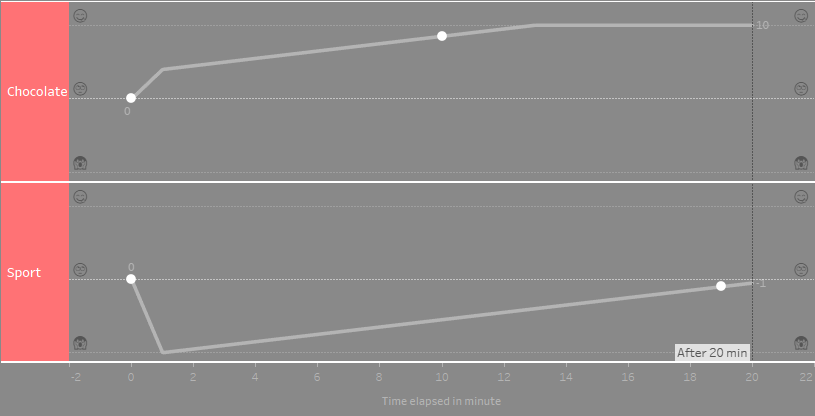
According to the diagram, it is clear. The feeling of well-being when eating chocolate is 10 at the end of the curve, while it is -1 when exercising. So chocolate is better than sport?
 Not really - the little devil has made it easy for himself and is not showing the whole truth. Because if the period under consideration is extended, the little angel sees a completely different picture:
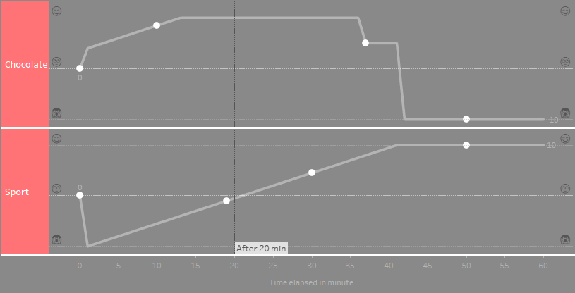
We can now see that well-being after an hour of exercise is 10 and eating chocolate is -10 - most likely due to the guilty conscience and stomach ache caused by too much sweet stuff. Projects often only look at a specific time period that really interests readers. To avoid misinterpretation, however, readers should be informed about this.
Assertion 2
The little devil says that doing sport increases the probability of dying by more than 500.
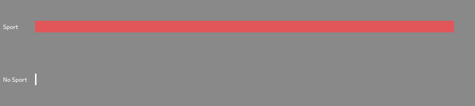
Once this diagram has been evaluated, one thing is certain: never exercise again - after all, you're not tired of life.
But where is the mistake here? With two bars, the little devil can claim a lot. The statement could just as well read: The probability of death increases 1000-fold. What is missing here is the axis labeling or better formatting in general. Then the angel would recognize a completely different statement:

The average probability of dying from sport is just 0.17 %. So it is more likely to die from the long-term effects of chocolate than from sport.
Assertion 3
In the next diagram, the little devil shows how high the probability of death is for individual sports.
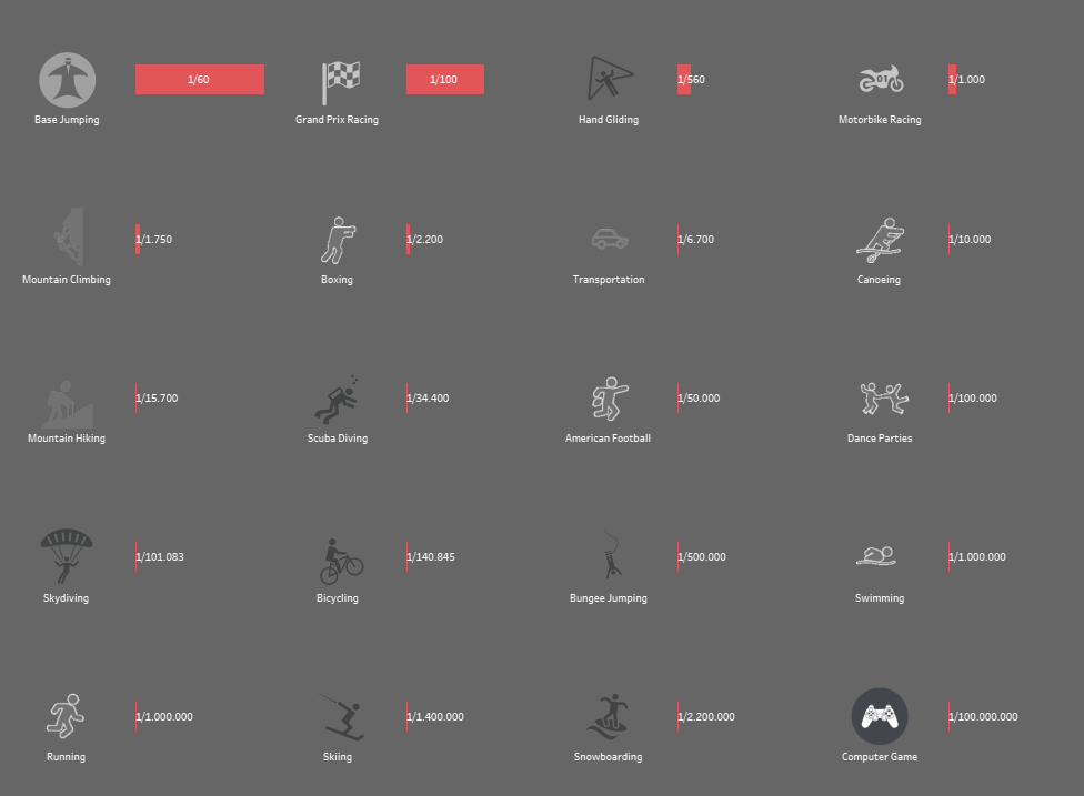
Should we stay on the couch now? Perhaps that would make sense. However, the little devil here shows mostly "minority sports" with a high risk, which are practiced by a small percentage of the population. Background information is deliberately withheld, giving the impression that all sports are life-threatening.
Conclusion: Goodbye data manipulation - provide background information and scrutinize diagrams
This dashboard makes it impressively clear what happens when no context is provided with a graphic. It is very easy to interpret or convey a different or incorrect message. For this reason, it is important to always show the reader exactly what can be seen, e.g. which time period is being considered. The axis labeling of the diagrams is also of great importance in order to be able to read out and question the correct statement. As Churchill said: "Don't trust statistics that you haven't falsified yourself."
We asked ourselves two more questions:
- Is it permissible to withhold information without telling the reader, and if so, when?
- How much information is necessary and when is it too much?
What is your opinion - feel free to share it using the comment function.
Still not enough of the topic?
This book is recommended in this context: How to Lie with Statistics by Darrell Huff
Read another blog post on the topic: Storytelling with Data
Data visualization: quickly identify correlations and make data usable interactively