The answer lies in the visualization of the results. Survey tools, such as Microsoft Forms do offer the option of visualizing the results, but the answers to the questions are evaluated and visualized individually, which makes it difficult to identify the correlations. This is where dashboards come in: They offer an intuitive and visual representation that makes patterns and trends easily recognizable.
In this article, we use a specific example to look at the visualization of survey results for the Artificial intelligence (AI). The topic "Artificial intelligence, the future or the end of humanity" was developed by Nikita Tsarev as part of an internship at the Institute of Business Analytics using a Google Forms survey. The collected data is then processed in a Power BI dashboard for detailed analyses.
The dashboard at a glance
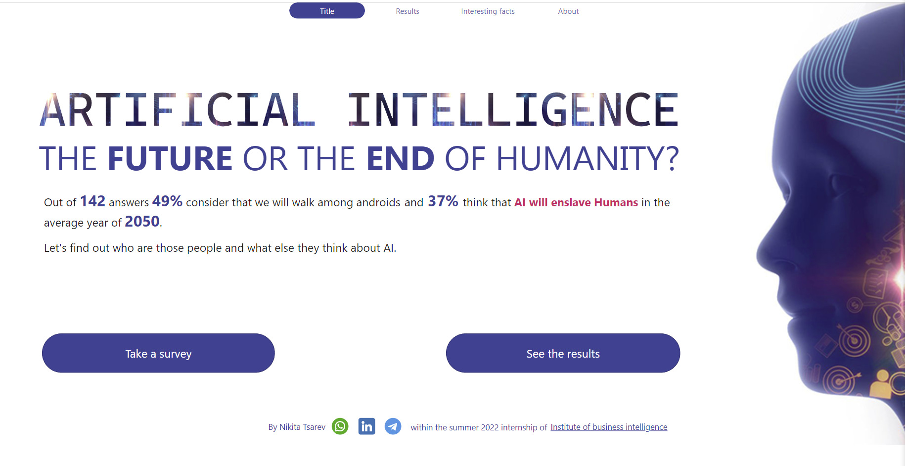
Front page
The main topic is presented here and a brief overview of the survey results is given. It serves as an entry point and guides the user to more detailed analyses.
Results page
This page offers an in-depth analysis of the survey results. You can filter and analyze different data points to gain specific insights.
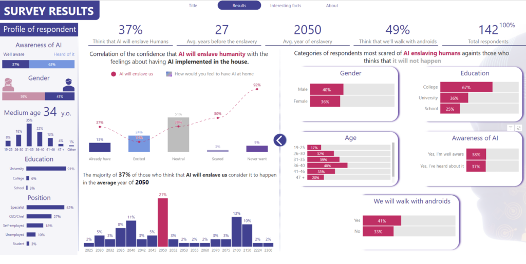
- Each individual visualization element also serves as a cross-dashboard filter. This allows you to scrutinize certain participant profiles independently of one another.
- On the left-hand side, the participant profiles are grouped according to familiarity with AI, gender, age, education and position.
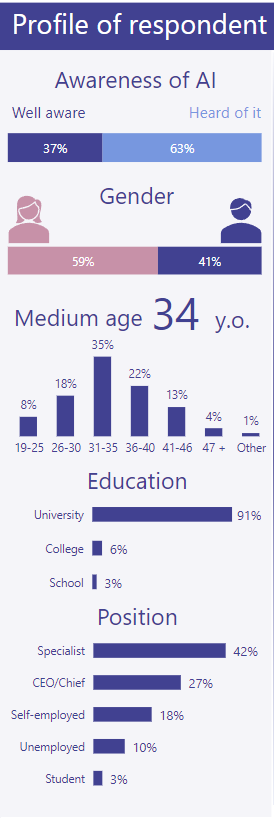
- Large key figures are shown in the bar at the top:

- In the middle range left are the following key figures
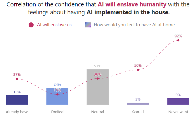
- Here, the correlation between the confidence that AI could enslave humanity and the feelings towards the use of AI in the household is visualized. The attitudes - from already existing AI to rejection - are shown using combined bar and line charts. One striking trend is that people with a negative attitude towards AI also tend to believe that AI could pose a threat to humanity.
-
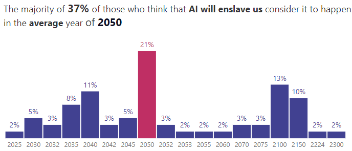
- Another KPI in this area shows the percentage of respondents who expect to be enslaved by AI and the expected timeframe for this. The bar chart highlights the most frequently mentioned year in color.
-
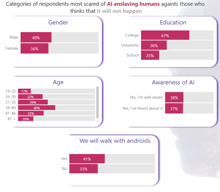
- On the right, in the middle section of the dashboard, the distribution of respondents is analyzed based on their fear of AI enslavement compared to those who think such a scenario is unlikely. This distribution is broken down into different categories, such as gender, education, age and AI awareness, and presented using stacked bar charts. Color coding differentiates between supporters and opponents of the enslavement theory.
Interesting facts
This page highlights interesting and surprising findings from the survey.
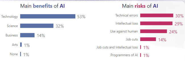
- One example on this page is a bar chart showing the opinions of the respondents. It shows both the main benefits and the main risks of AI. It is clear that many see the primary benefit of AI in the technology area, while at the same time they see technical errors as the primary risk.
Key findings from the dashboard
- The visualization of the survey results in this dashboard provides some revealing insights into respondents' opinions and attitudes towards artificial intelligence.
- A significant number of respondents believe that AI will play a dominant role in the future, with some even believing that AI could enslave humanity.
- There is a clear correlation between attitudes towards AI and opinions about its future role. People with negative views about AI tend to make more pessimistic predictions about its future role.
- Technical advantages are seen as the main benefit of AI, while technical errors are seen as the biggest risk.
From survey to dashboard: the process
Transforming survey results into an informative dashboard is a multi-step process that requires both technical know-how and an understanding of data visualization. But how do you go from a simple data set to a visual representation that provides insights?
- Data export: Depending on the survey tool used, such as Microsoft Forms or Google Forms, the collected data can be exported in different formats, such as CSV or Excel. This step is important to ensure that the data is in a form that can be read by business intelligence (BI) tools such as Tableau.
- Data cleansing: Before importing into a BI tool, it is often necessary to clean and format the data. This can include removing duplicates, correcting errors or restructuring data to prepare it optimally for analysis.
- Data import and integration: After data cleansing, the data is imported into a suitable BI tool, such as Tableau. This tool makes it possible to combine and integrate data from different sources, which is useful if you want to combine data from several surveys or additional data sources.
- Visualization and interactivity: With the data in Tableau, users can start creating dashboards. It is important to choose the right chart types and design the layout to be intuitive and informative. A special feature of Tableau is its ability to build high interactivity into the visualizations. Users can use filters, drill-downs and tooltips to dive deeper into the data and gain specific insights.
Conclusion
In summary, dashboards provide a valuable way to visualize survey results and gain deeper insights. They present data in a clear and visual way to quickly identify trends and patterns. The integration of interactive elements, such as filters and drill-down functions, also allows the dashboard to be personalized to meet specific target group requirements. Although creating dashboards takes time and resources, in some cases it is worth the effort if the survey is the basis for important data-based decisions.