In line with the division of our Big Data working group presented last time, we consider the following questions in this article:
- Data integration: How do the data sources need to be connected to the system, processed and stored?
- Data analysis: How and with which procedures must the available data be analyzed and processed?
- Data visualization: How are the results presented to the user in a suitable way?
We have launched the "SAPPhiRE" (Social mediA Price PREdiction) project to test this in practice: Based on tweets and the historicized Bitcoin price, a forecasting model for the digital currency's price is being created. In terms of technology, we relied on a selection from the Hadoop Ecosystem decide, for the visualization we rely on Tableau.
For the machine learning model, we chose Spark MLlib. The technology is described in more detail in the course of the article.
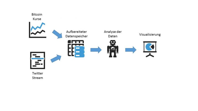
The Bitcoin price is relatively easy to set up using a REST interface from CoinDesc read out. For this purpose, a self-written bash script is run, which reads out the current price once a minute (https://api.coindesk.com/v1/bpi/currentprice.json) and saves it. To get a Loss of information to avoid, the entire JSON can be saved.
When reading out the Tweets from Twitter we expect a Permanently high data volume. For this reason, we have opted for a Streaming approach decided (Twitter offers a corresponding API an). This differs from the first-mentioned REST principle in that a fixed connection between our client and the Twitter server and the data is then transmitted continuously.
As we have all the data for both the Bitcoin and Twitter data Raw data over a longer period of time, it can in any case be assumed that very large amounts of energy will be required relatively quickly. Large amounts of data will come together. This means that the three V's - Volume, variance and velocity - that describe a big data problem.
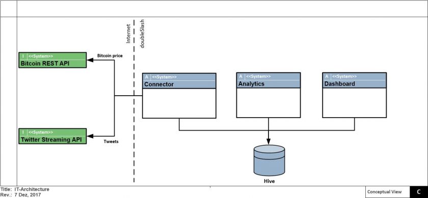
For this reason, we will focus on the best possible implementation of the Scalable microservice architecture on the basis of Docker with Spark (which also has a corresponding streaming API) and Hive as a database set.
Data analysis: Processing the data with Spark MLlib
For further analysis of the data, we decided to use Spark MLlib decided. MLlib offers a API for the most popular machine learning algorithms for the detection of clusters, the calculation of classifications and regressions or more specialized methods such as Collaborative filtering. On the other hand, there are various APIs (Scala, Java, Phyton or R) that can be used to program Spark.

As Spark is based on distributed data structures and in-memory works, it is also possible to Large amounts of data efficiently process and analyze. As a result, Spark MLlib has a significant advantage in the processing of big data problems. Speed advantage compared to other technologies.
Spark has developed the concept of DataFrames was introduced. This enables the programmer to work "SQL-like" on the data used, while Spark is able to process the entire data. "Magic"i.e. the Distribution and management of data in the clusterin the background. At the same time, you can use DataFrames connect different data sources, for example structured data files or Hive.

A simple application example - implemented with Spark MLlib
To get a better understanding of how Spark MLlib works, I would like to present a simple application example below. In it, a simple linear regression on the Development of the Bitcoin price be applied over 30 days (from 24.12.2017-24.01.2018). Based on this regression, a Forecast for the next 30 days (23.02.2018). We are aware that the significance of this forecast is limited. Nevertheless, this example is a good way of gaining an initial insight into the associated Java API to get.
In the first step, the data is read from a text file. The values stored in the file represent the price (label) and the corresponding date as a consecutive number (since 01.01.1900).
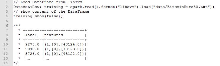
Subsequently, the linear regression on the basis of the imported training data calculated.

Finally, we output the most important data from the optimized model and calculate a corresponding prediction of the Bitcoin price.
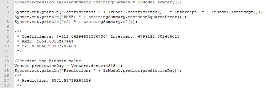
The output data can now be interpreted as follows:
- The calculated value R²=49% indicates that the regression maps the training data relatively poorly (100% corresponds to a perfect mapping)
- The deviation of the training data from the trained model is RMSE≈1054.64 €
- The course can be organized using
Bitcoin price=4799192.302486015-111,06294631536736×DatumAlsFortlaufendeZahl calculate - Based on the regression, the Bitcoin price for 23.02.2018 is predicted to be ≈ € 6381.92
The respective Results must then be completed in a final step cached again so that they can then be used for the graphical representation further processed can be used.
For the visualization of the analysis results, we have opted for Tableau decided by Gartner in the Gartner Magic Quadrant in the Business Intelligence and Analysis Platforms category for five years in a row. Leader was classified.
Tableau is a Self-service BI solutionwhich enables the user to Connect different data sources and then convert this data to visualize and analyze. Tableau offers an extreme Wide range of visualization options. The user can quickly and easily Individualized dashboards and through the interactive visualization gain new insights from the data. Tableau also enables a Collaborative workby creating dashboards throughout the organization shared with other users can be used.
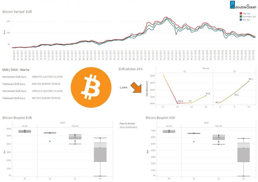
Tableau currently offers around 68 integrated connectors for connecting various data sources. In addition to popular data sources such as Oracle, AWS Redshift, Cubes, Teradata, Microsoft SQL Server also includes a Interface to Cloudera Hadoopwhich is particularly relevant for our project and was an important selection criterion when choosing the visualization tool.
Besides Tableau Desktop and Tableau Server not only offers different products, but also several license models. Tableau Server, for example, offers the Necessary flexibility for integration into an existing data infrastructure or the Saving the data on-premise in the cloud. We want to create the visualization on Tableau Desktop and run it on Tableau Server, which has been available since January 2018, at Linux provide.
We have now clarified how the Basic architecture of our system should look like, Which components are necessary and with which technologies we want to enter the race. We have a first, very simple Algorithm which basically shows how a Implementation with MLlib can look like.
In the next article, we will describe how we have expanded our model in order to improve its informative value. In particular, we will analyze the data from Twitter and try to develop a Possible correlation with the Bitcoin price produce.