In daily product development, two worlds collide: designers who work in Figma to structure, visualize, and prototype—and developers who translate those same ideas into code, relying on our technical doubleSlash Living Styleguide As long as design and code follow different systems, friction arises where speed and clarity are actually needed. Prototypes look good, but have to be laboriously translated into technical components manually. Adjustments have to be maintained twice. And inconsistencies creep in again and again. Our existing setup was slowing us down—and we needed a new approach.
Naming conventions: The key to efficiency
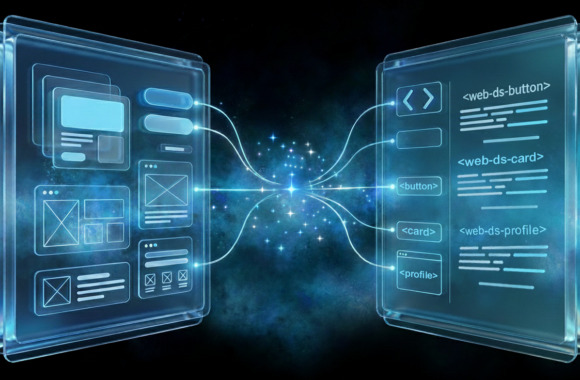
The biggest advance is that design and code now share the same system. Figma components now have exactly the same names as the corresponding web components from our Living Style Guide. This has a decisive effect: based on the naming of the Figma component, the AI can automatically recognize which component from the Living Style Guide is meant. It translates prototypes directly into style guide-compliant interfaces—without much manual effort.
The Model Context Protocol (MCP) Server from Figma plays a central role in this process. It transfers the entire context of the Figma design directly to our Living Style Guide web components via AI. An additional Cursor Ruleset significantly improves AI prompting, ensuring reproducible results. This means:
- Developers no longer need to interpret
- Designers no longer need to build idealized mockups
- New UI components can even be generated directly from Figma.
- Feedback loops, design deviations, and time-consuming „ping-pong“ are significantly reduced.
More clarity, less friction – Building bridges with the design system
A design system fulfills its purpose best when it creates clarity—visually, technically, and semantically. That's exactly what our current solution does: the shared logic between Figma and Living Styleguide ensures that processes are not only faster, but also clearer and more robust. At the same time, a design system is only as good as its maintenance. Inconsistent naming conventions, missing documentation, or unclear variants can destabilize even a strong system—which is why consistency and continuous development remain essential. It is particularly valuable today that our infrastructure enables automation in both directions:
- From Figma to the Living Style Guide: New components that do not yet exist in the Living Style Guide can first be modeled in Figma and then converted into real web components using AI.
- From the Living Style Guide to Figma: Conversely, we already build in Figma using components whose naming corresponds exactly to the Living Style Guide Web Components. The AI can generate production-ready UIs directly from this—without having to interpret anything and without media discontinuity.
Personal conclusion: A design system as an invisible helper
A design system is successful when teams no longer consciously notice it—because it has become a natural part of their daily work and the software development process in the exploration and design phases. It works in the background and reduces complexity before it arises. The close coupling of our Figma UI Library with the doubleSlash Living Styleguide is one of the biggest steps we have taken towards efficiency, consistency, and productive collaboration—for the further development of the style guide and for new products.