

Explanation of terms
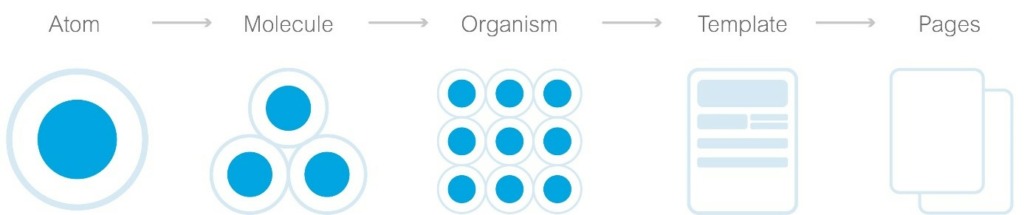
Atomic Design was developed by Brad Frost and enables us to simplify and structure complex designs and user interfaces. The user interface is broken down into reusable components and organized in different levels of abstraction. [2]
The five levels are:
- Atoms: The most basic elements that cannot be broken down further into individual parts, such as buttons, inputs or text elements like links.
- MoleculesGroups of atoms that together form a functional unit.
- OrganismsComplex components consisting of molecules, atoms or other organisms.
- TemplatesFrameworks for content placement, define the structure of a page.
- PagesSpecific instances of templates with real content, showing the final design.
[1]
Is Atomic Design suitable for Angular applications?
In a nutshell: Yes. Angular is a component-based framework and supports the reusability of components. Atomic design can help to further structure and organize UI components in Angular.
Atoms and molecules in Angular could be implemented as reusable components and directives. These include, for example, search fields, buttons, textareas and dropdowns.
Organisms could represent more complex components or component groups that combine several molecules. Examples of this would be cookie banners, dialogs or navigation bars.
Templates and pages would manifest themselves as component layouts and routable views that display specific content. [2] [3]
Can Atomic Design replace the official Angular architecture?
The official Angular architecture recommends a division into different categories such as Core, Shared, and Feature. It makes no difference whether modules are used or "standalone components" (available from Angular 14).
Core: Contains all core elements of an application that only exist once.
Shared: Contains reusable components, pipes and directives that can be used in different parts of the application.
Features: Contain all components, services and other elements that are necessary for a specific feature.
Atomic Design can supplement this structure by further subdividing and organizing it. For example, the shared module can be further subdivided into atoms and molecules and continue to provide all elements such as buttons, input fields, etc.
However, a clear assignment is not always possible. Organisms such as a footer should be assigned to the core. Whereas dialogs that are used by different features clearly belong in the shared category.
Nevertheless, Atomic Design offers a valuable addition. [4]
∇ app
    ∇ core
         ∇ guards
              auth.guard.ts                  // Überprüft die Authentifizierung des Benutzers
         ∇ interceptor
              token.interceptor.ts           // Fügt das JWT zum Header der Anfragen hinzu
              error.interceptor.ts           // Zentralisierte Fehlerbehandlung für HTTP-Anfragen
         ∇ services
              auth.service.ts                // Handhabt Authentifizierung und Benutzerdaten
              api.service.ts                 // Zentralisiert die Verwaltung von API-Anfragen
         ∇ components
              ∇ navbar                       // Navbar, ein Organismus
                    navbar.component.html
                    navbar.component.scss
                    navbar.component.ts
              ∇ footer                       // Footer, ein weiterer Organismus
                    footer.component.html
                    footer.component.scss
                    footer.component.ts
              ∇ page-not-found
                    page-not-found.component.html
                    page-not-found.component.scss
                    page-not-found.component.ts
         ∇ constants
              app-config.ts                  // Allgemeine Konfigurationswerte
              api-endpoints.ts               // Zentralisierte API-Endpoints
         ∇ enums
              role.enum.ts                   // Enum für Benutzerrollen
              status.enum.ts                 // Enum für Statuscodes
         ∇ models
              user.model.ts                  // Benutzermodell
              product.model.ts               // Produktmodell
    ∇ features
         ∇ product-listing                   // Feature Modul für Produktlisten
              ∇ components
                    ∇ product-item           // Organismus: Einzelnes Produkt
                            product-item.component.html
                            product-item.component.scss
                            product-item.component.ts
                    ∇ product-grid           // Template: Anordnung der Produkt-Items
                            product-grid.component.html
                            product-grid.component.scss
                            product-grid.component.ts
              ∇ pages
                   ∇ product-list-page       // Seite: Nutzt das Product Grid Template
                        product-list-page.component.html
                        product-list-page.component.scss
                        product-list-page.component.ts
                   ∇ product-detail-page     // Seite: Detailansicht eines Produkts
                        product-detail-page.component.html
                        product-detail-page.component.scss
                        product-detail-page.component.ts
              ∇ models
                    product.model.ts         // Spezifisches Modell für Produkte
              ∇ services
                    product.service.ts       // Service für produktbezogene Daten
              feature-a-routing.module.ts   // Routing für dieses Feature
              feature-a.component.ts        // Root-Komponente des Features, falls benötigt
    ∇ shared
         ∇ components
              ∇ button                      // Atom: Allgemeiner Button
                   button.component.html
                   button.component.scss
                   button.component.ts
              ∇ input-field                 // Atom: Texteingabefeld
                   input-field.component.html
                   input-field.component.scss
                   input-field.component.ts
              ∇ form-field                  // Molekül: Kombiniert Label und Input-Field
                   form-field.component.html
                   form-field.component.scss
                   form-field.component.ts
         ∇ directives
              tooltip.directive.ts          // Direktive für Tooltips
         ∇ pipes
              translate.pipe.ts       // Pipe für Währungsformatierung
         shared.module.ts                   // Definiert das Shared Modul
    styles.scss
    ▽ styles
        variables.scss
    ▽ assets
        ▽ i18n
            en.json
            de.json
        ▽ images
            logo.svg
            banner.svg
How does Atomic Design relate to component-based development?
Atomic design and component-based development are closely linked. Both concepts focus on the development of reusable components. In Angular, a framework based on component architecture, atomic design enables a systematic approach to component development. By breaking down user interfaces into atoms, molecules, organisms and so on, developers can create a clear structure and hierarchy for their components. This promotes the reusability and maintainability of components, which in turn improves the efficiency of the development and maintenance of Angular applications. [3]
Conclusion
Atomic Design offers a useful method for organizing and structuring components in Angular applications. It does not replace the existing Angular architecture, but can usefully complement it to improve efficiency, consistency and reusability within an application. [2]
Sources:
[1] doubleSlash Living Styleguide
[2] Atomic Design
[3] eggplant - How to Use Angular and Atomic Design to Create Web Applications: A Guide for New Developers
[4] Medium - Atomic design in Angular project