Compared to normal map displays, a Grid of hexagons in the karst representation the great advantage that the size of the geographical region is irrelevant, making it much easier to compare the regions visually. Furthermore, the Hex Tile Map guarantees a Higher rendering performance compared to normal map displays. This is particularly helpful when a large region or large, complex calculations or data sets need to be displayed geographically.
Although the Hex Tile Map offers some advantages compared to a normal map display, it is relatively difficult to create such a map, especially for the European region. On the one hand, Europe has a large number of countries and also many small countries or city states, which makes it difficult to create a uniform arrangement with a simultaneous recognition value compared to a normal map of Europe. Countries such as the USA are much easier to transfer to a hex tile map, so that the outline of the USA is also recognizable.
Some people have already tried to transfer the map of Europe to a hex tile map, as some examples on Tableau Public show:
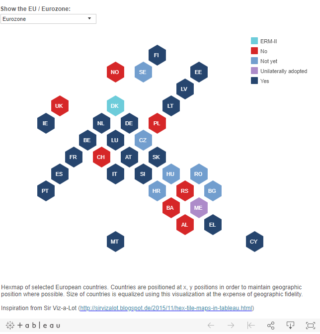
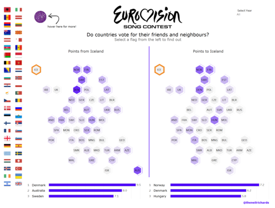
However, since the above examples show us the Recognition value of the map of Europe was not high enough and not all countries from Europe were represented, we decided in our Data visualization team took up the challenge ourselves and attempted to transfer Europe to a hex tile map.
How did we go about creating a hex tile map?
Based on the instructions of Matt Chambers creating your own hex tile map actually sounds quite simple:
- Create an Excel file with numerical values for X- and Y-axis position and create this as a source in Tableau
- Drag X-axis values into columns, Y-axis values into rows
- Select a suitable display
- Replace points with the Hex Tile shapes
- Adjust the view if necessary...and you're done!
The crux of the story: Step 1.
Just finding the right numerical values for the positions of the tiles on the X and Y axes doesn't sound that complicated. However, it turned out to be an unexpected challenge due to the many small countries and city states.
At first, we simply dared to try the Tiles on a grid back and forth again and again. Unfortunately, this never led to the desired result. But then we had the brilliant idea: the Map of Europe as background to take (1), a Grid over it (2) and then the Tiles accordingly on the map Position (3) to then remove the background map again (4).
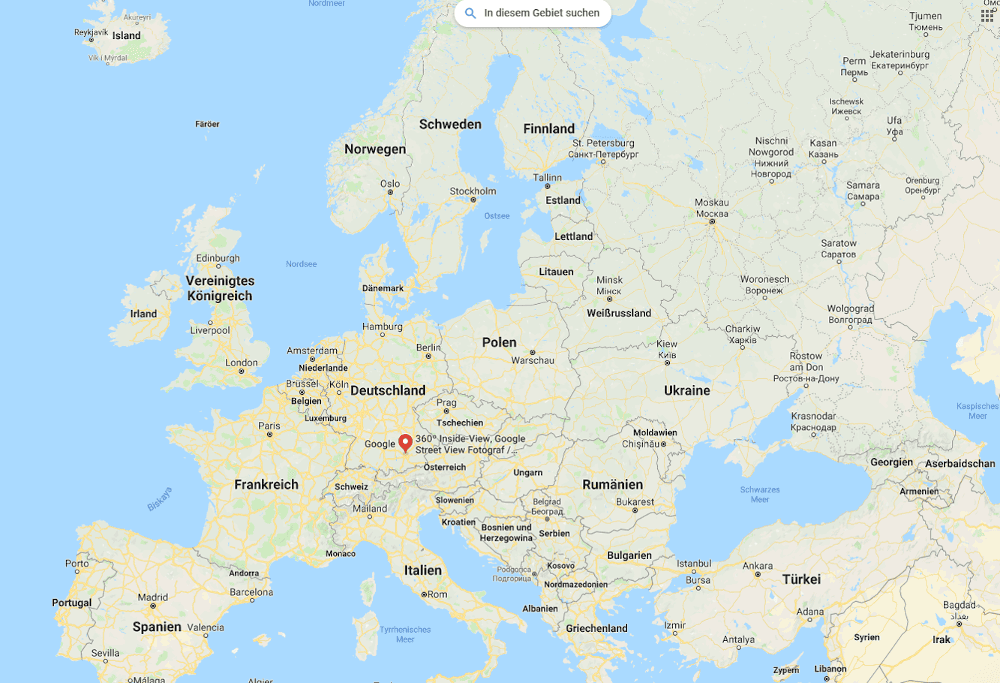
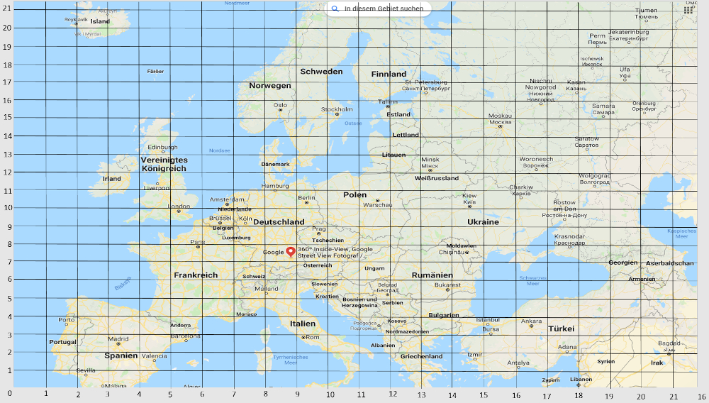
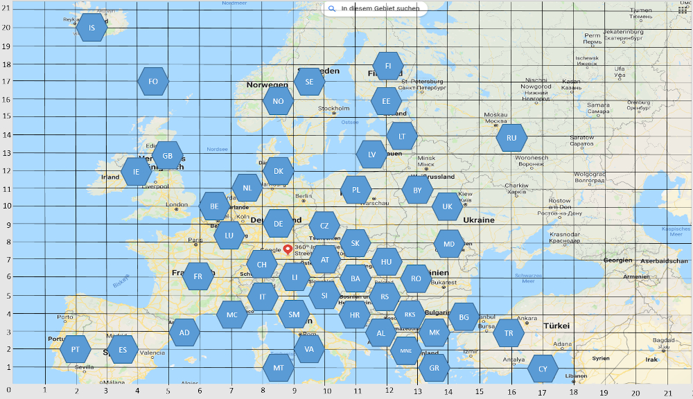
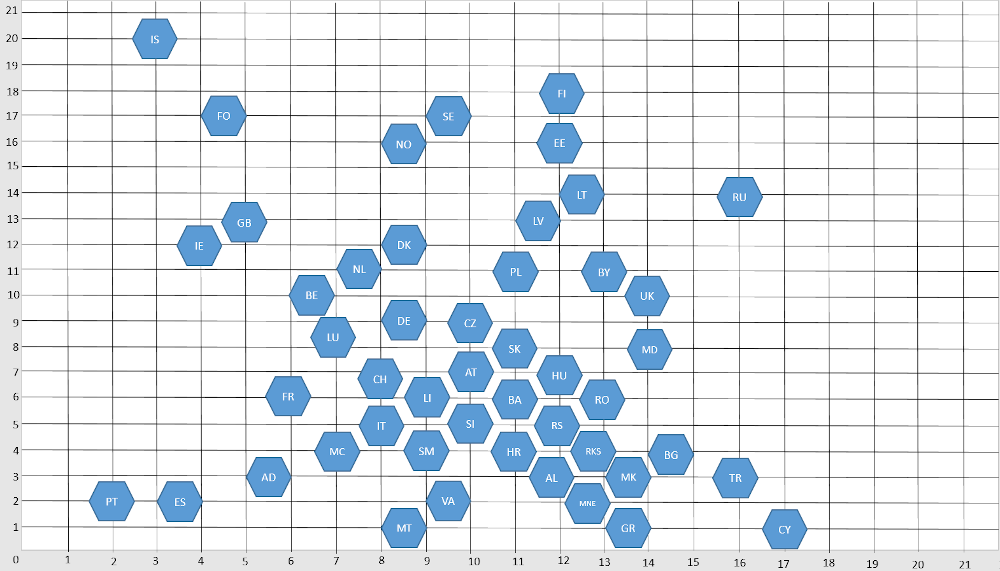
Source: Own illustration - our approach to creating a hex tile map
In order to set comprehensible values for the X and Y values of the grid, we then used the values of the longitude and latitude of the countries instead of the numbers from 0 - 20. The idea behind this was that the area could possibly be extended to larger areas using this approach. As we were still not completely satisfied with the result, we shifted back and forth a bit to get a more compact form of the hex tile map.
Our Hex Tile Map of Europe
We also found the hex tile map with the map of Europe in the background very appealing, so we simply combined both variants in our final dashboard without further ado:
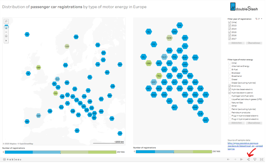
In our example, we used a data set from Eurostat (New registration of passenger cars by type of motor energy), which contains the registrations of vehicles by drive technology.
Workbook to go
With the "Share" button in our workbook you can download it directly - or if you don't like our grid, simply make your own challenge out of it. Bind with this link everything in your homepage right away.
Either way, we hope you enjoy visualizing and look forward to you commenting on your results.
You may also be interested in these articles:
- Best practices: Which is the right tool for data preparation with Tableau
- The top 3 business intelligence tools - a short story