The vaccination dashboard is an initiative of the Federal Ministry of Health and is intended to provide all citizens with a clear, up-to-date status of vaccination progress in Germany.
Technically, it is a very long landing page, which is displayed in the frontend with the Svelte framework was implemented. It contains many diagrams and other data visualizations, which we will now take a closer look at section by section.
The current vaccination status
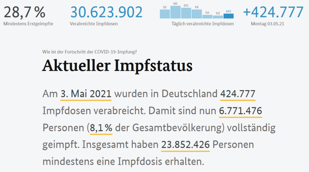
This can be found at the top as the first section. It contains a kind of header that shows the three most important figures on the topic:
- On the left, the percentage share of At least first vaccinatednext to the total number of vaccine doses administered and right, how many Vaccine doses administered yesterday were.
- The presentation of the last week without giving exact figures. This means you know immediately whether there has been an increase in the past seven days or not. In addition, you can immediately see that there is a "dip" from Saturday to Monday. It would therefore be superfluous to give the exact figures here and would only inflate the whole thing unnecessarily.
- The centrally displayed introductory text explains more details about the Total number of vaccine doses administered (breakdown of first vaccination and complete vaccination, etc.). This is supported by the yellow underlining of the numbers.
The vaccination clock - an eye-catcher in data visualization
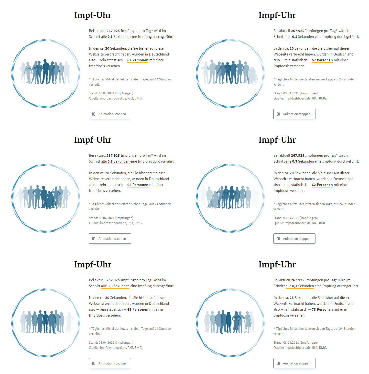
It serves as a transition to the next section. A special eye-catcher here is the animation including a schematic representation of various vaccination groups:
Vaccination progress by federal state
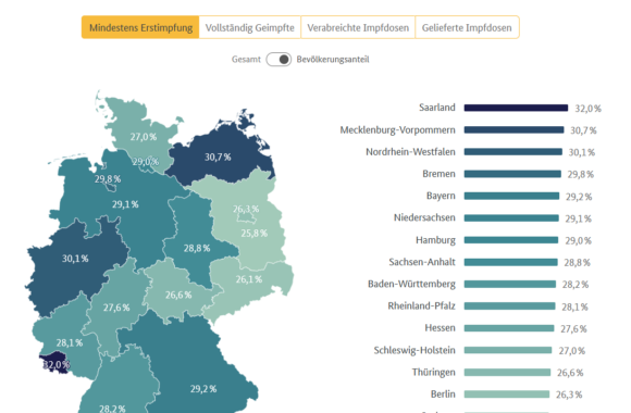
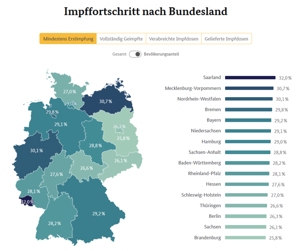
This is located in the second section and uses a map of Germany to show the percentage of vaccinated persons per federal state. You can choose between "Fully vaccinated", "At least first vaccination", "Vaccine doses administered" and "Vaccine doses delivered".
Next to the map is a horizontal bar chart. Here you can see which federal state is currently in the lead. There is also a switch that shows the change between "Total" or "Population share". The diagrams and figures adapt accordingly.
The vaccination progress - hover feature for clear data visualization
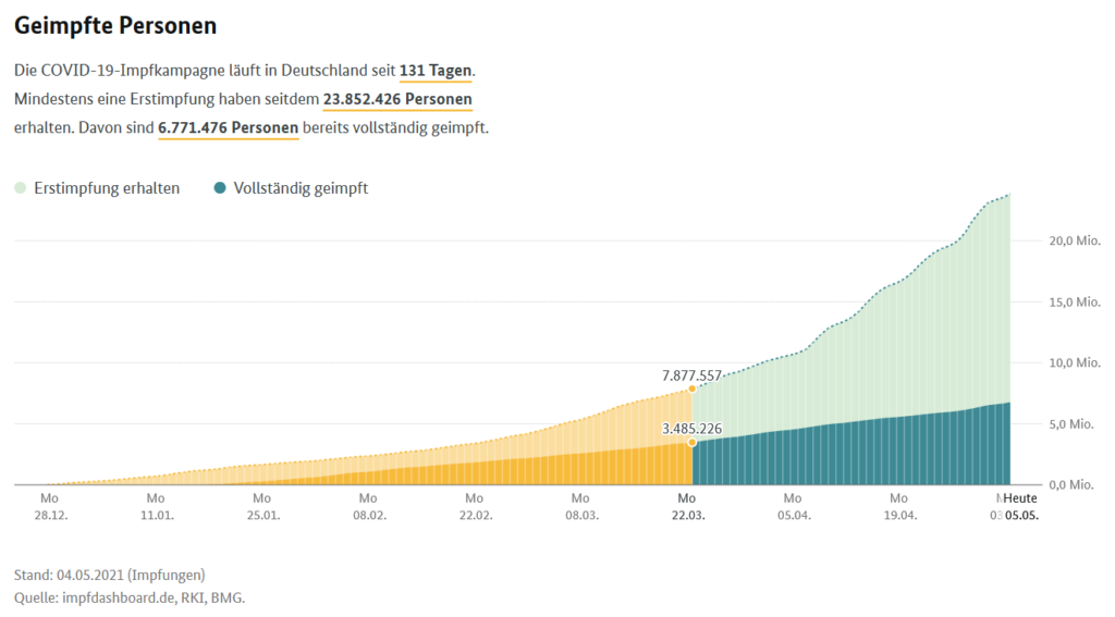
The vaccination progress is shown as the third section with the same figures from the text - as in section 1. The only new information is when the vaccination campaign started.
The used Area diagram with slightly indicated daily bars and additional hover feature to display the specific figures is very clear and easy to understand. Please note that the X-axis only represents the assembly for temporal orientation. To see a specific day, the hover feature must be used. In addition, the Y-axis shifted to the rightas this makes it easier to see how high the area of the diagram is.
The daily doses of vaccine administered
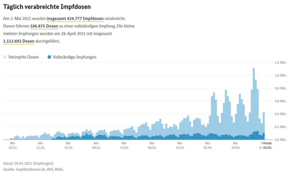
The fourth section shows the daily doses of vaccine administered. Here the information of all doses administered yesterday into complete vaccinations. In addition, you can see the number of Most vaccinations in one day. Very convenient for the user: The Same timeline as in the previous section used. The Y-axis created on the right is retained.
Depending on the data, the display changes from an area diagram to a Daily bar chart. Visually, it is immediately apparent that it is no longer about the total number (area), but about the daily values. The hover feature for displaying the exact figures per day is also available here.
The vaccine deliveries
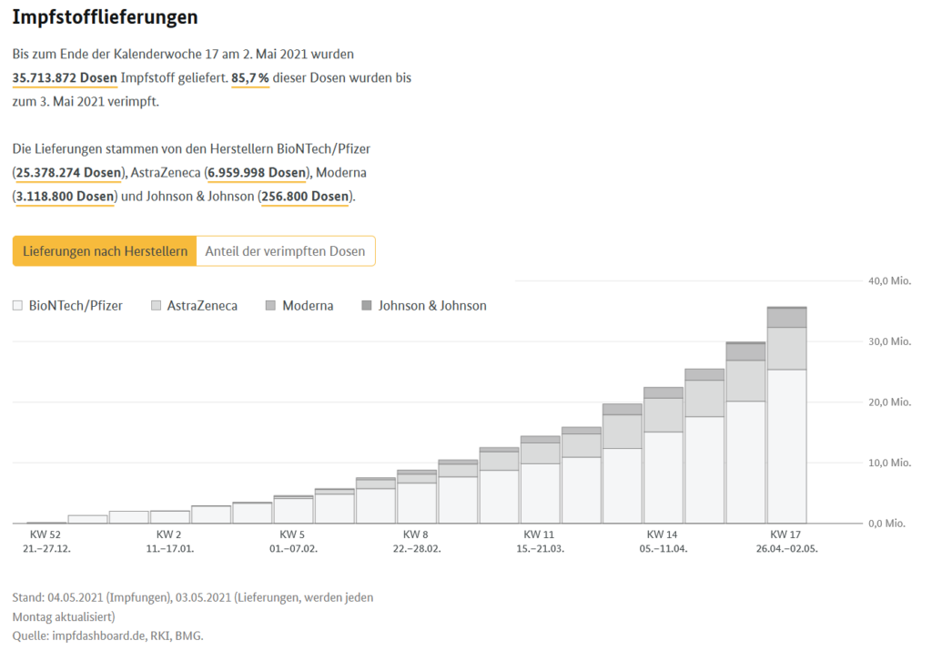
In the fifth section, the vaccine deliveries represent the "background data" on vaccination progress to date. Here, the user can see at a glance how many of the vaccine doses delivered have already been vaccinated. The quantity ratio of the various vaccine manufacturers is also shown in this section. combined area and bar chart quickly. Although you are presented with a relatively large amount of information in one diagram, you don't have to think about it for long, as the same axes and hover features have been reused. You can choose whether you want to display the delivery by manufacturer or the number of doses inoculated in the diagram.
The data on primary and secondary vaccinations are presented here for the first time. not shown. This would probably have resulted in a diagram that was too complex.
The vaccination priorities: Quantity ratios simply visualized
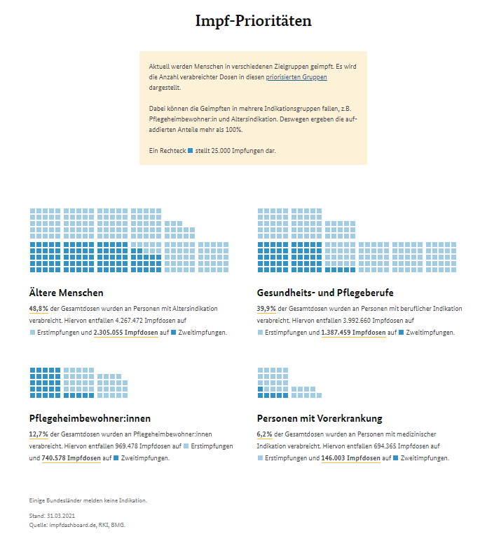
The penultimate section is about the vaccination priorities. They have not been updated since April 1, 2021 and are archived with the last data status of March 31, 2021. The data is presented in cubes in order to quickly record the quantity ratios. The reused colors for primary (dark blue) and secondary vaccination (light blue) also reiterate the information from before.
As an alternative to the dice, a pie chart could also have been used here. This would have made it possible to see the relationships between the different groups even more quickly.
The milestones: Data visualization on the timeline
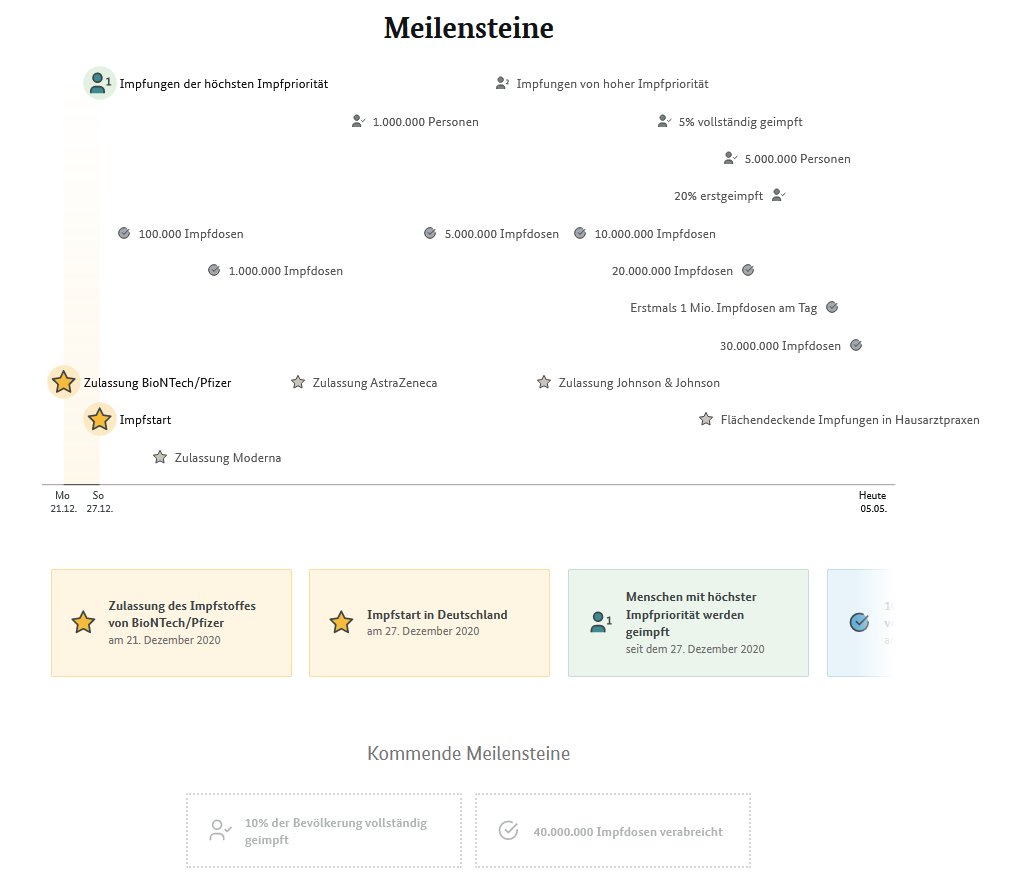
At the end of the Vaccination dashboards milestones are used. Milestones already achieved are displayed using a timeline. Here, too, you can use the hover function to see the exact date of achievement. Still Upcoming milestones are not presented quite so boldly below.
The vaccination dashboard is a Very clear presentation of a wide range of informationwhich is enhanced with special eye-catchers such as the vaccination clock and hover features. As a user, you immediately notice that professionals were at work on the implementation of the dashboard. But it is only on closer inspection that the actual reasons for this become apparent, such as the shift of the Y-axis to the right. This makes it easier for the eye to see the exact height of the area on the scale, as the data is so close to the scale.
A very successful dashboard overall, which fully fulfills its purpose. There are only a few points that could have been optimized. This makes it fun to consume even complex data.
Co-author: Markus Wingler
Learn more about data visualization