Her post was about how to create diagrams correctly and the pitfalls to watch out for. I would like to pick up on this topic in my blog post and give you tips to help you draw the right conclusions from diagrams.
Tips for the correct interpretation of visualizations
What do you need to look out for when reading a visualization and how can you tell whether a visualization has been manipulated? The following examples provide tips on how to interpret dashboards even more successfully in future and how to base decisions on solid data.
Recognize manipulated axes in diagrams
As an example, consider the following problem: We look at gasoline prices in cents over the last few years in Germany. If you look at the non-manipulated diagram, the prices have risen over the last few years, as expected. [5]
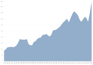
Now the manipulated graphic:
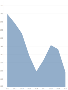
Manipulated gasoline price in cents per year in Germany, Source: Own representation in Tableau
What experienced dashboard readers should notice immediately is that the y-axis does not start at 0. This is often a sign that the chart has been changed by the creator. This can also be done out of ignorance, as the creator believes that this makes the chart easier to understand. In this example, the change ensures that the decrease in the price in 2016 and 2020 looks much more dramatic than in the non-manipulated chart. This impression is reinforced by the gas-dipped x-axis. It is therefore also important to scrutinize the proportions of a chart.
Another thing to note when reading a chart is the truncated x-axis. In this example, it should be noted that only a few years are considered, and especially the most recent ones are missing. In this case, it makes sense to do further research and also look at the missing years. Then you can quickly see that prices have not always fallen, as shown here, but have risen significantly.
In summary, it is important to pay attention to the labels on the axes in order to recognize whether the axes have been cut off. It also makes sense to always keep an eye on the numbers and the proportions of the axes. If one is very compressed, you should be suspicious. In our example, this is very obvious, as only odd years are shown. However, the straight lines are not for reasons of space. This indicates that the graphic has been manipulated.
Data basis and the confounding factors
Confounding factors are values that are not actually explicitly considered in a statistic, but nevertheless influence the result. One of the most common confounding factors is the age of the people being tested. I would like to take a closer look at this. [6]
Let's take a look at this example from a video by the German Society for Internal Intensive Care and Emergency Medicine, where the findings are even reversed once age is taken into account. [3]
Here we look at the death rate of two cities and see that city A has a higher death rate.
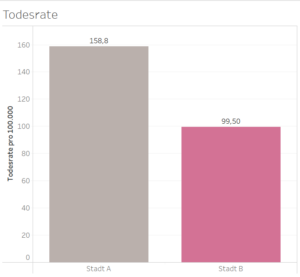
If we had to decide which of the two cities we would like to live in based on the graph, we would probably choose city B. However, it is important to take into account the confounding factors, as age can also have an impact on mortality rates, as older people are generally more likely to die than young people.
We therefore decide to take a closer look at the data and examine the mortality rate by age group. What will we discover?

The figures marked in red are the death rates per 100,000 by age group. It quickly becomes apparent that all death rates by age group are higher in city B than in city A. But why is that?
There are significantly more older people living in city A than city B and they die proportionally more often than the younger inhabitants: inside. This distorts the overall mortality rate in such a way that it provides completely contradictory findings compared to the mortality rate by age group.
As a reader: you should always consider whether hidden factors that influence the result have been included in a statistic and then look at these separately. Unfortunately, there is no way to test whether other factors influence the results using only the visualization. It is therefore important to find out more about the topic and look at the data as a whole.
This example shows that it is important not only to rely on the visualization of diagrams, but also to look at the data. This allows us to recognize whether there are other factors that can influence the visualization.
Share vs. absolute
Another source of misinterpretation is the difference between percentage and absolute values. The following chart clearly shows this:
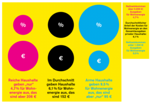
If you look at the size of the districts, this changes to such an extent that the poor households pay the smallest amount in absolute terms, but the opposite is true for the average share as a percentage.
It is therefore important to pay attention to the figures in order to recognize the correct data situation more easily than just by looking at the visualization.
For example, one could conclude from the pro rata figures that rich households consume less energy than middle or low-income households. However, this is a fallacy that is revealed when you look at the absolute figures. [7]
The recommendation for action here is clear: look at the figures. Both the absolute and the pro rata figures. This allows readers to compare the two and draw the right conclusions.
Comparison of data: Correlation Vs. Causality
Correlation? Causality? What was that again? Correlation is a relationship between two statistical values, but this does not necessarily mean that they influence each other. [1, 4]
If this is the case, we speak of causality. This means that one value really influences the other, i.e. is the cause of the effect/behavior of the other value. For example, there is strong evidence that smoking causes lung cancer. That would be causality. [1, 4]
The most important thing at a glance: Correlation does not mean causation!
Correlations can occur purely by chance. A key figure to measure the strength of a correlation is the correlation coefficient, also known as the r-value. This assumes values between -1 and 1. Values from -1 to 0 indicate a negative correlation. Values from 0 to 1 indicate a positive correlation. If the r-value is very close to 0, e.g. -0.02 or 0.02, caution is advised because this correlation could occur by chance. [2]
You should also be careful with small samples because you cannot assume that they are representative.
Even with an r-value close to 1 or -1 and a sufficiently large sample, causality is not necessarily present if a correlation is recognizable. In the following diagram, for example, the r-value is 0.992558.
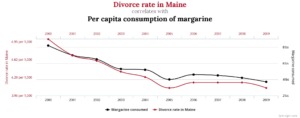
Looking at the graph, the divorce rate in Maine and the per capita consumption of margarine appear to be related. So does higher margarine consumption cause divorce? Or do divorced people eat more margarine? Neither is likely to be the case - so this correlation is purely coincidental.
Logic can often be used to rule out causality. For example, after briefly reflecting on our diagram, it becomes clear that more margarine does not lead to more divorces. If you get a strange feeling, it is also worth checking the source to see whether it appears trustworthy and whether there is more information on the data and diagrams.
In summary, it is important to note that correlations do not necessarily imply causality. In order to assess this, it makes sense to carry out further research and look for studies that prove causality. However, this only makes sense if the facts presented appear conclusive. If, as here, margarine consumption is linked to divorce, it can be assumed in advance that the diagram cannot come from a reputable source.
In order to recognize intentionally or unintentionally manipulated diagrams and draw the right conclusions from them, it is not enough to just quickly look at the visualization. It is always important to pay attention to the figures and the axes in your statistics. If something seems strange, it is advisable to do further research on the topic shown.
Furthermore, it is worth questioning whether the facts presented also appear to make sense. This is particularly important in the case of correlations, as these can often occur purely by chance.
Source:
[1] Blech, R. 2022. correlation and causality - distinction and example. https://studyflix.de/statistik/korrelation-und-kausalitat-2216. Accessed December 16, 2022.
[2] Blech, R. 2022. correlation coefficient - examples and calculation. https://studyflix.de/statistik/korrelationskoeffizient-2290. Accessed December 16, 2022.
[3] German Society for Internal Intensive Care Medicine and Emergency Medicine. 2016. age as a confounder in studies. https://www.youtube.com/watch?v=lF-qkCceQZ8. Accessed December 16, 2022.
[4] Engelhardt, A. 2014. correlation and causality | crash course in statistics. https://www.crashkurs-statistik.de/korrelation-und-kausalitaet/. Accessed December 16, 2022.
[5] Münch, J. 2022. Goodbye data manipulation - providing background information and questioning diagrams (Part 1) - Business - Software and IT Blog - We shape digital value creation. https://staging.blog.doubleslash.de/datenmanipulation-ade-hintergrundinfos-bieten-und-diagramme-hinterfragen-teil-1/. Accessed December 16, 2022.
[6] Saemann, A. 2015. disruptive factor - DocCheck Flexikon. https://flexikon.doccheck.com/de/St%C3%B6rfaktor. Accessed December 16, 2022.
[7] Sauer, T. 2022. this text increases your knowledge by 200 %. https://www.fluter.de/statistiken-tricks. Accessed December 19, 2022.