You can read about the extent of this in the following blog posts:
Goodbye data manipulation - providing background information and scrutinizing diagrams (Part 1)
Goodbye data manipulation - interpreting charts correctly and exposing manipulated data
These articles look at the topic from the reader's perspective. So what should I look out for when reading a diagram or dashboard?
Of course there is another side. The creator's side. This is very important, because the creator has the whole Powerbe it consciously or unconsciously. What the creator delivers in the end is what the reader draws his information from.
For this reason, we want to give you the basic Dos and Don'ts of data visualization in order to present readers with the perfect result.
Dos and Don‚ts for diagrams
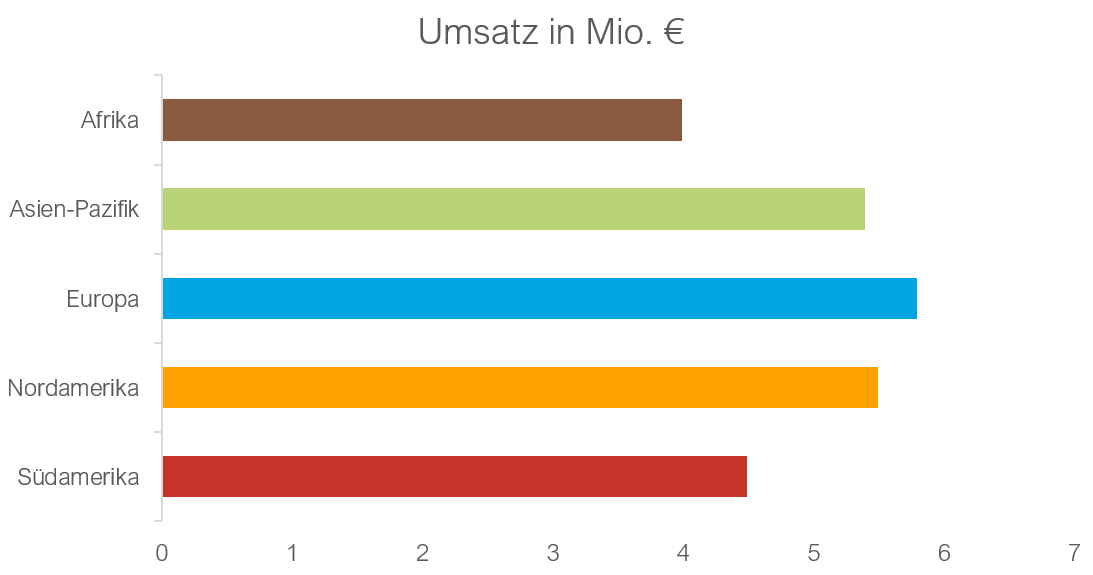
Keep it simple
Simplicity is the key to comprehensibility. Overloaded diagrams or overly complex graphics can easily be overwhelming.
Dos
Don'ts
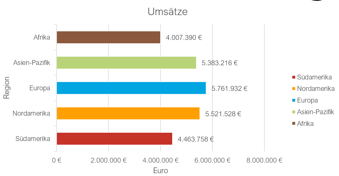
- Focus on the most important data points.
- Avoid unnecessary decorations or effects.
- Use clear and understandable labeling.
- Do not overload with too much data or information.
- Avoid too many colors or fonts.
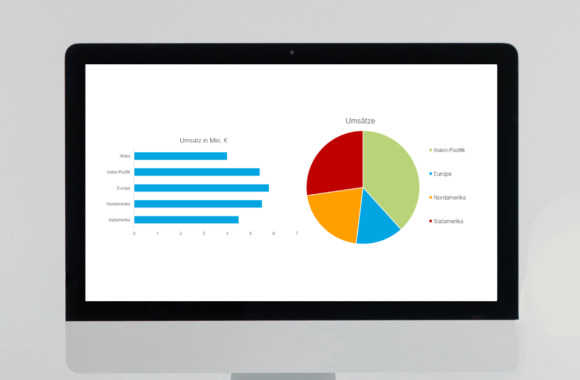
Bar over cake: Length comparisons are more intuitive
Humans are naturally better at comparing lengths than areas or angles.
Dos
Don'ts
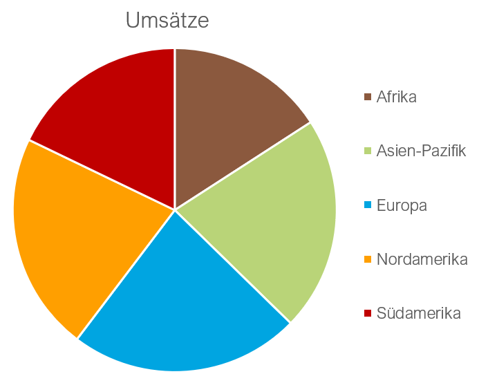
- Use a bar or column chart to compare quantities or values with each other.
- Make sure that the scale is consistent and easy to understand. - Avoid pie charts when directly comparing quantities.
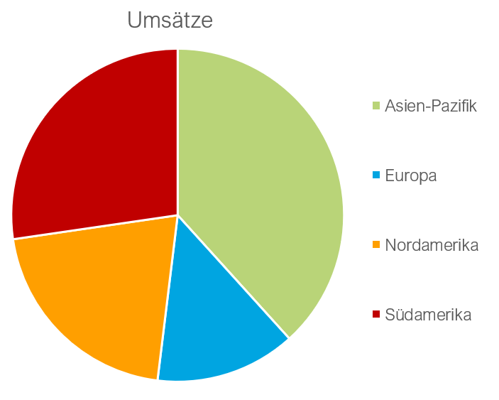
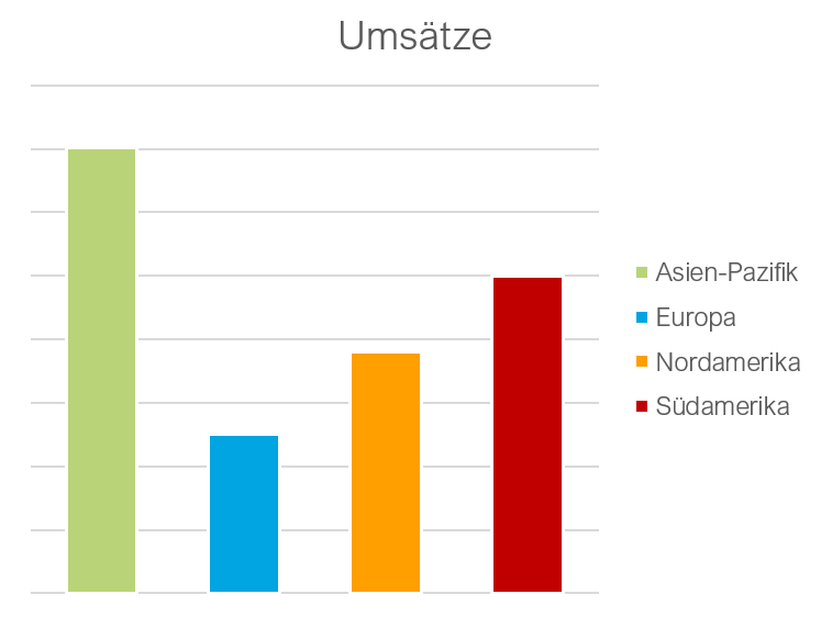
Cake for proportions: Show proportions clearly
Pie charts are ideal for displaying parts of a whole.
Dos
Don'ts
- Use pie charts when proportions of a whole are to be displayed.
- Label each section clearly.
- Caution: With a large number of segments, pie charts can become unclear and confusing. They become illegible and the differences between the segments are difficult to recognize.
Avoid bar charts or column charts when it comes to representing parts of a whole.
Dos and Don‚ts for colors
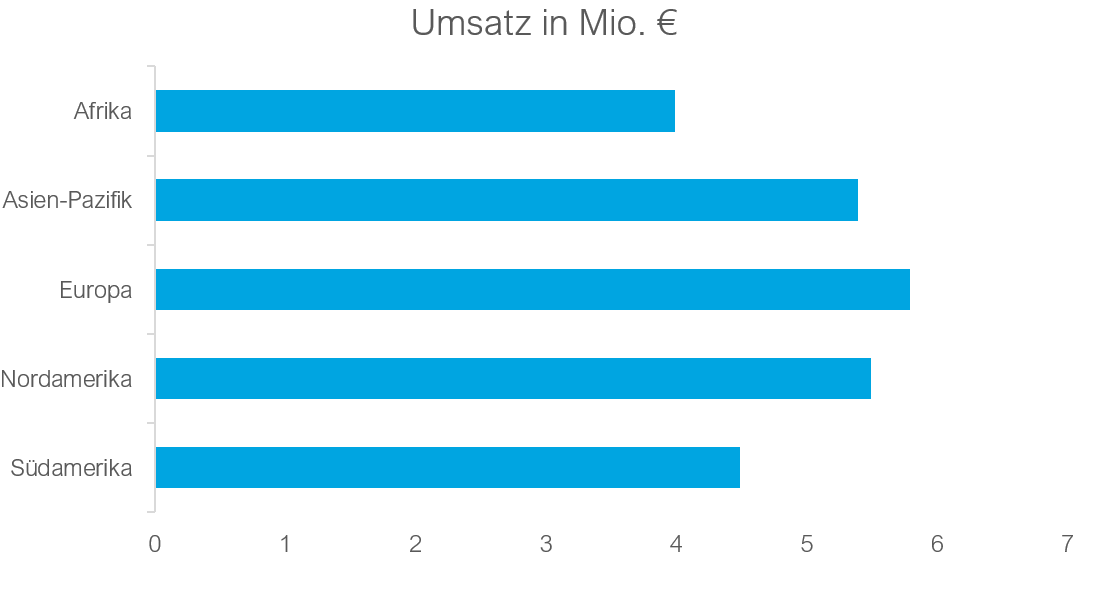
Use of corporate design
The corporate design ensures that all means of communication look consistent and professional.
Dos
Don'ts
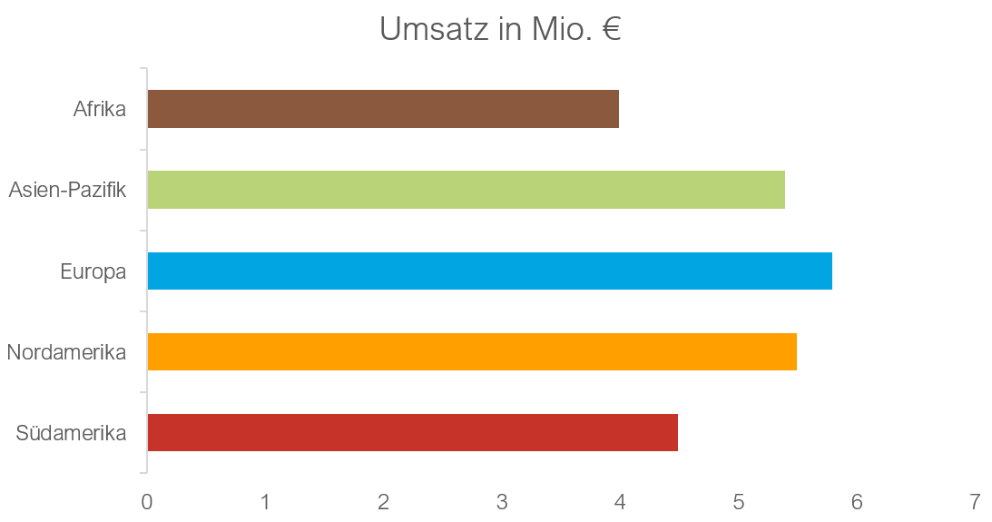
- Always use the official colors, fonts and logos of the company/customer.
- Ensure that all diagrams and graphics comply with the company's/customer's design guidelines.
- Avoid non-approved colors, fonts or images.
Less is more
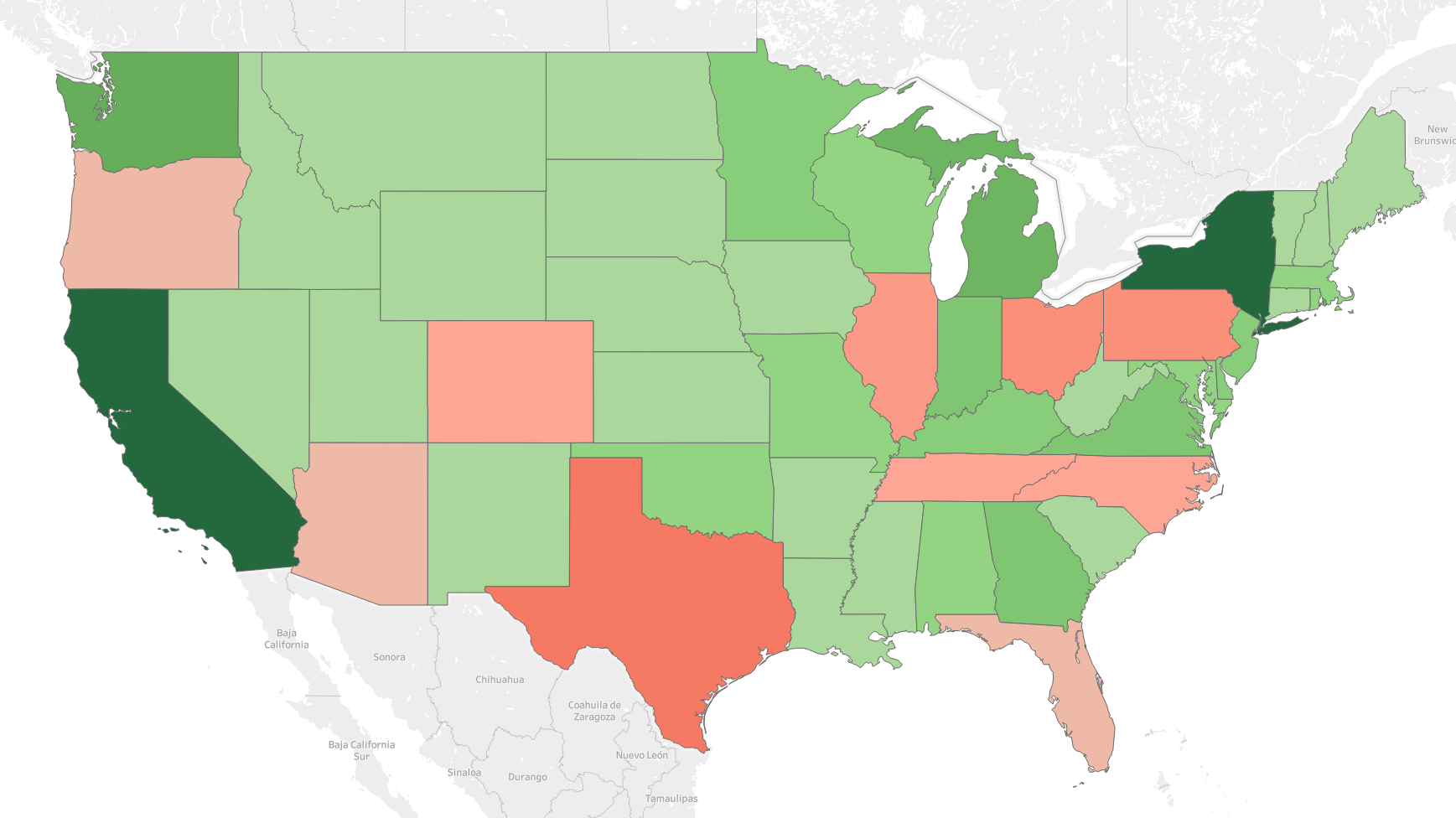
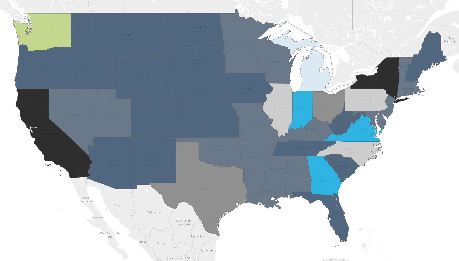
Individual colors with different shades make it easier to read cards.
Dos
Don'ts
- Use colors with different shades.
- Use a maximum of 2 colors in the color gradient.
- Avoid too many different colors, they quickly appear overloaded.
- Note the function of the colors.
Conclusion
The world of data visualization is diverse and subjective, but certain basic principles provide guidance for presenting information clearly and effectively. Although our preferences vary and there is no universal "right way", the dos and don'ts of data visualization discussed here allow us to improve the quality of our visualizations. They serve as valuable guidelines for presenting our data in a way that is not only accurate but also appealing. By taking these principles to heart, we can ensure that our messages reach the desired audience and are understood. In conclusion, regular reflection and looking at examples will help us to hone our skills and develop our own style.
This article is a summary of the work of Aron Szabo, Christoph Hoffmann and Janina Stifel.