This is more than just the creation of diagrams - it is the result of a structured process that begins with the requirements analysis and ends with the presentation of decision-relevant information. The aim was to describe the entire process from data integration to analysis and visualization, using the example of the sales revenue of a medical technology provider.

Procedure for data visualization
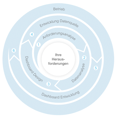
The illustration above shows the section of our process modelwhich focuses on three main topics: Data integration, analysis and visualization.
In order to develop a dashboard that meets the requirements, the process must always begin with the requirements analysis. This is where the use case is defined, which can then be adapted again and again to meet changing requirements.
Key questions about dashboard development
To successfully map a use case, three questions should be clarified:
- WHO? Who is the target group of the visualization?
- WHAT? Which tasks should the visualization support? Which questions need to be answered?
- HOW? Which KPIs are relevant to answer this question?
Once these questions have been answered, suitable forms of presentation such as diagrams, tables, traffic lights and other visualization elements are selected. It is important to choose a suitable form of presentation for each KPI so that dashboard users can intuitively and quickly extract the information they are looking for and derive the right action measures from it.
Arrangement and structure in the dashboard
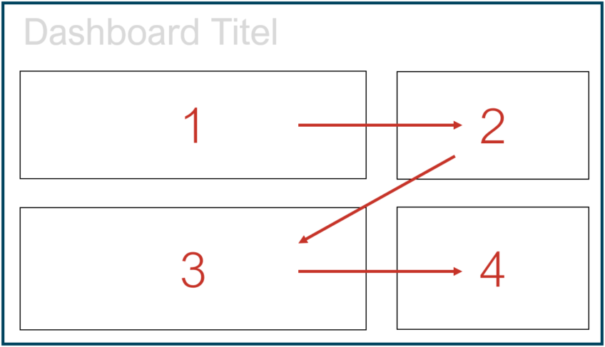
The arrangement and order of the individual elements of a dashboard play a central role. A clear structure and attention to proportions are essential. The "golden ratio" in particular is often used in well-designed dashboards. The positioning of the elements is based on the reading direction - from left to right, from top to bottom - to enable the viewer to absorb information logically and intuitively.
Result of the visualization
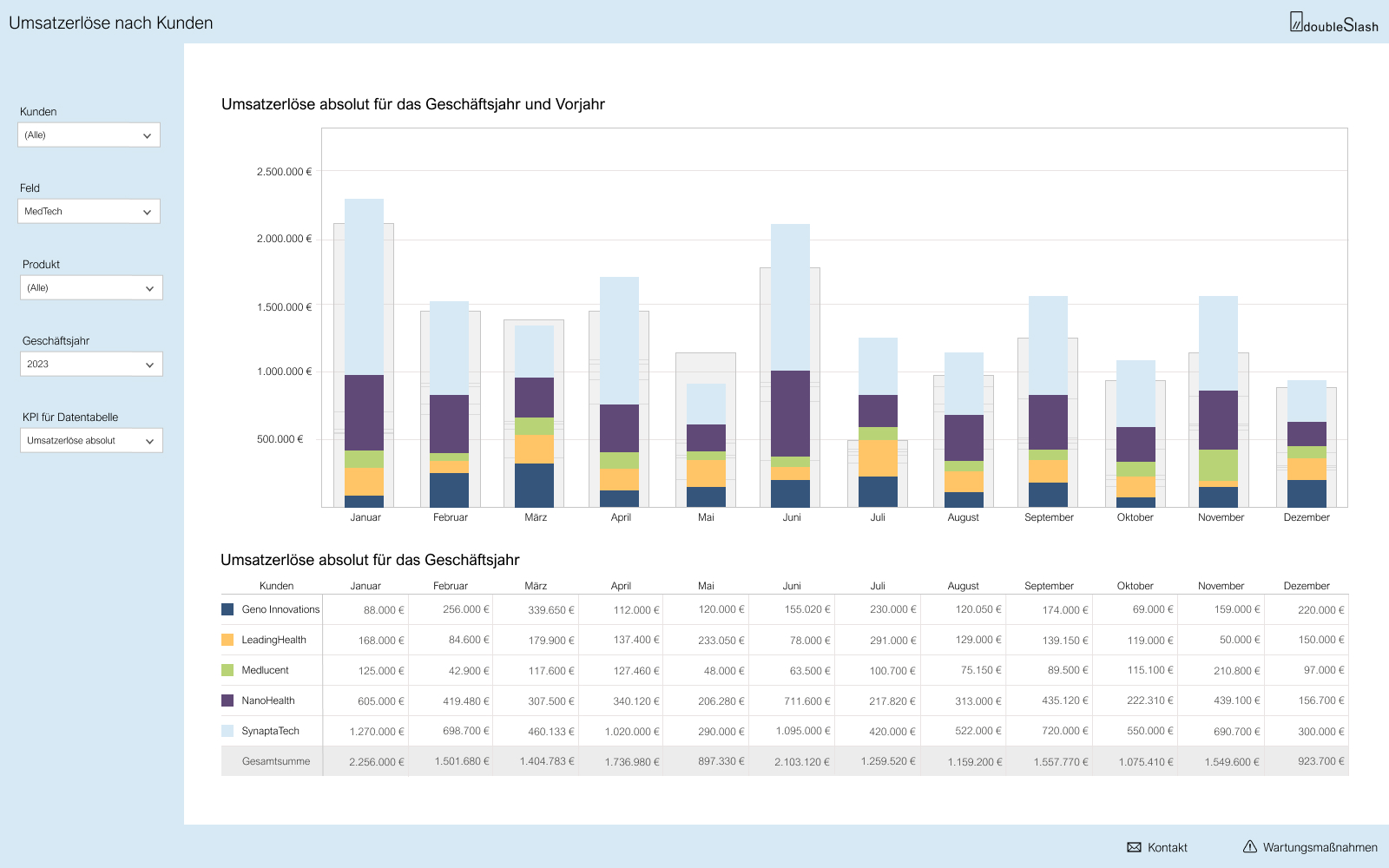
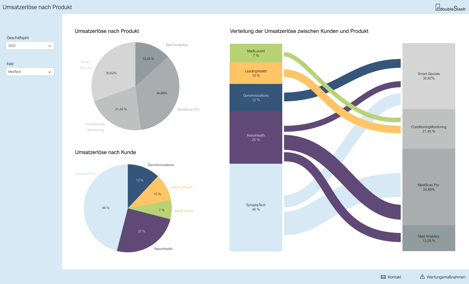
Careful planning and implementation results in a dashboard that provides users with clear and targeted information. One example shows the visualization of sales revenue by customer and product/service.
And the result looks like this:
Conclusion
Data visualization is much more than just the creation of diagrams and begins with the Requirements management and the development of KPIs. In addition, it takes a lot of time and expertise to develop the necessary Data to integrate and to transform.
With the Visualization is on the red thread that guides users intuitively through the dashboard.
It is important to never lose sight of the actual goal: To enable users to intuitively Data-driven decisions to fell.
Did you miss the first and second part of our "Road to Dashboard" series? Learn more about the Data integration here and about the Data analysis in medical technology here. Join us all the way to perfect data visualization!