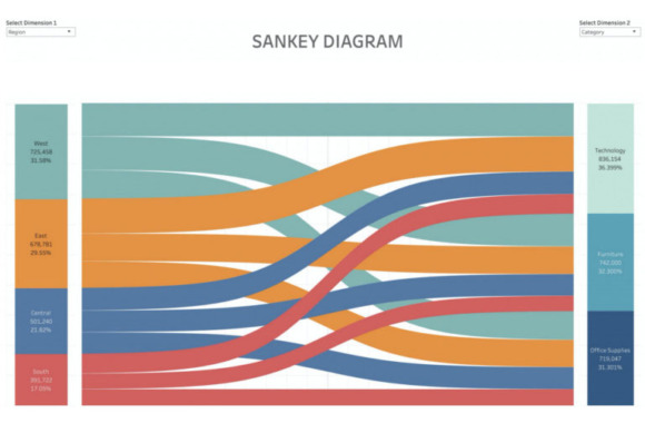
A Sankey diagram is a graphical representation of quantity flows. This diagram is ideal for displaying a breakdown such as energy flows or sales figures. In the following diagram, the flows show the breakdown of sales revenue. The sales regions are shown on the left and the individual sales segments on the right. The flows show how the sales of the regions flow proportionately into the various segments:
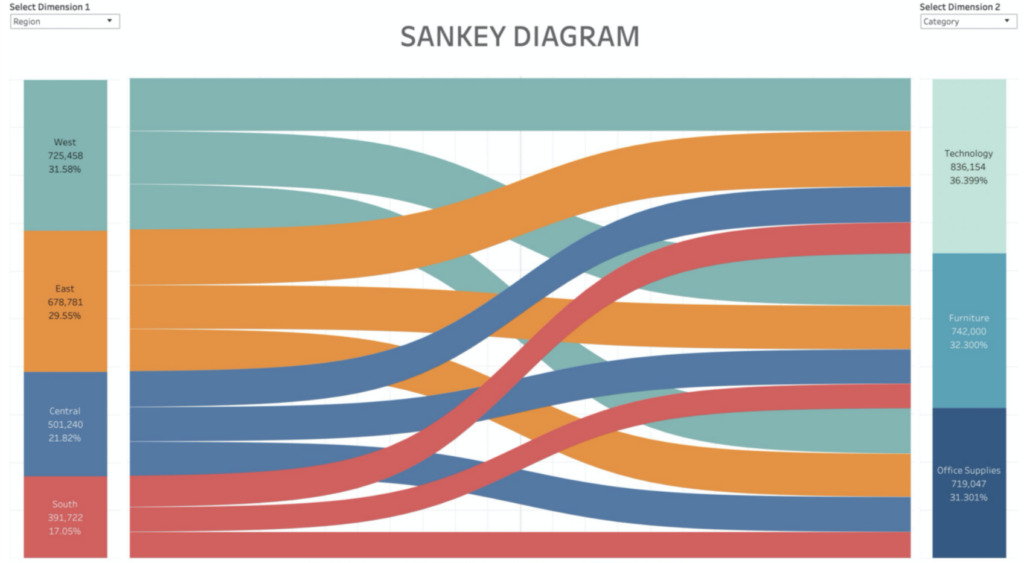
The level of turnover is reflected both by the width of the flows and the size of the segments within the first column, i.e. the wider the flow or segment, the higher the turnover.
Multi-level Sankey diagram - What's behind it?
Multi-level Sankey diagrams are a Sankey diagram with more than two columns. The following diagram is from a service provider's project and illustrates the data preparation process:
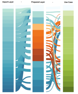
The 3 pillars all stand for one step in the ETL process:
Import Layer:
This is where the workflows responsible for collecting data from various sources are located.
Prepared Layer:
This is where the workflows are located, which define the data schema if necessary, clean up the data and make it readable.
Use Case:
The use case itself then contains the workflows that are responsible for the analyses. The data is prepared by adding further data, calculating the required key figures, filtering the data, etc.. This preparation can be minimal, but can also be extensive.
The dashboard above states each "box" in a column for a workflow. Each layer has its own color. The workflows from the import layer are blue, those from the prepared layer are orange and the use cases are green. On this dashboard, it is still somewhat difficult to see exactly what data flows out of which workflow and which workflow flows into which workflow. The application example below shows the best way to use this dashboard.
For a Sankey diagram, you need a specific value that is present in all data sets in order to display the flows. As shown above, for example, the amounts of turnover. In this multi-level Sankey diagram, however, there is no uniform value that flows through everything. The flows are therefore based on the number of data records that a workflow reads in or writes out. To ensure that the dashboard remains clear and that one box does not become extremely large and another box is no longer visible, the size of the boxes has been calculated so that they are all the same size.
The benefits of multi-level Sankey diagrams
As ETL processes are very complex, they are often rather confusing and you cannot recognize in a tool what kind of Connections between the individual workflows exist. However, the correlations are important for bug fixing, for example, or to get an overview. This is why the Multi-Level Sankey was developed in order to Correlations between the workflows visible. This makes troubleshooting easier, for example, as you know which workflows are connected.
A dashboard like this can be particularly helpful if you want to change something in a workflow and need to check it, which other workflows are affected by this.
If, for example, you want to know what influences the operating performance use case, select only the operating performance in the filter above the use cases layer. The dashboard is adjusted so that only the inputs of this use case are displayed:
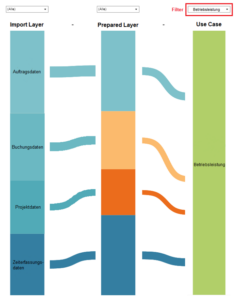
You can see here that four imports have an influence on the operating performance. These are order data and time recording data directly without prior processing in the prepared layer, and booking data and project data only after processing in the prepared layer.
Conclusion on data visualization with multi-level Sankey diagrams
The multi-level Sankey diagram is an extension of the Sankey diagram and is particularly useful for Correlations between data can be displayed. In contrast to the normal Sankey diagram, it not only shows the flows between two columns, but can also be applied to any number of columns. This makes it easier to find errors in ETL processes, for example, as these processes are very complex and confusing. With the multi-level Sankey diagram, the Present connections well and thus facilitate bug fixing, among other things, by quickly recognizing correlations.