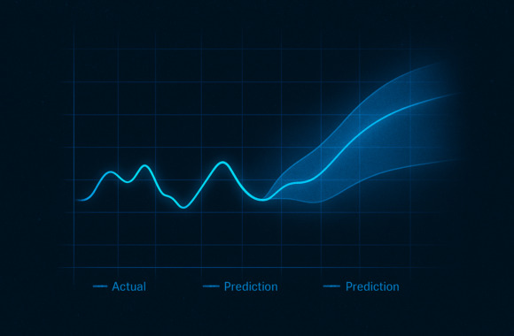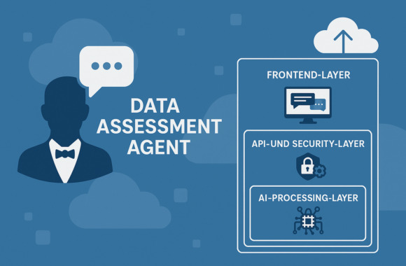
But why do stories have such an enormous impact on us and what does this have to do with data? And how can the concept of storytelling be transferred from stories to data visualization?

The impact of stories
In order to be able to transfer the effect of stories to data visualization, we must first understand why stories leave such a lasting impression on us and why we sometimes insist with defiant curiosity on finding out the end of a story or getting the continuation of a story. We are sometimes even prepared to spend more money on stories than the purely rational material value would justify. Just think, for example, of the success (also in monetary terms) and the excitement generated by series such as Game of Thrones. But why and how does it all work? The explanation lies in the irrationality of the matter and the associated emotionality of narratives.
This is because stories stimulate more areas of the brain than is necessary for the mere understanding of facts and figures. When we hear stories, images are created in our heads that awaken emotions in us. This effect of stories, images, sensory impressions and emotions leaves a much stronger impression on us than a pure number or fact ever could. We are eager to find out how a story ends and are prepared to invest time and money in it. We use stories to plant an idea in the minds of the audience and sell it.
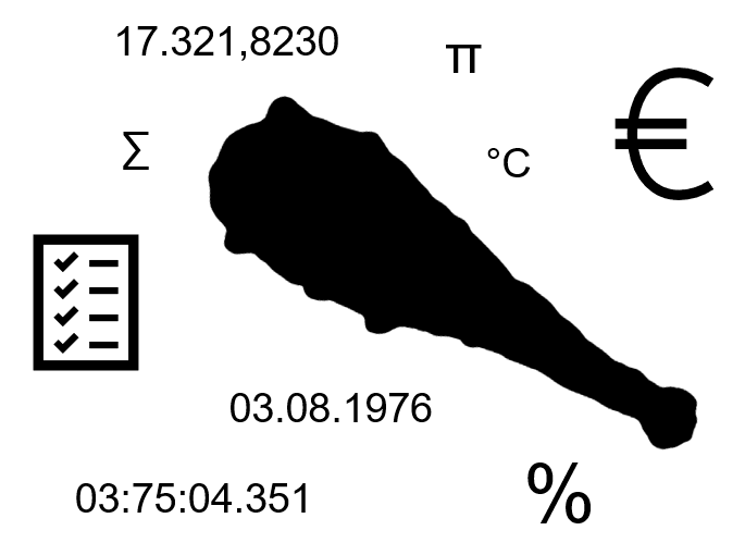
And this is exactly where we can make facts and figures more interesting. So, before we start swinging the facts and figures club next time, perhaps we could consider how our facts and figures can be presented with the help of a story, illustrate our point of view and perhaps even increase interest in investment?
The storytelling method
So how do you create a good story? We should clarify this before we can integrate a story into the data visualization.

Initially, the focus is on the Setup. You should consider who the audience is, what the topic and also the core message is that you want to talk about and then choose the context of the story accordingly (place, time, actors, situation).

Then the Perspective or the protagonist chosen. The strongest stories are those that you can tell from your own perspective because you have experienced them yourself. The more emotions and impressions you describe that the listener can relate to, the stronger the relationship between you and your listener will be.

In the next step Tension generated. Tell the story in small bites so that curiosity arises. The story should create questions in the listener's mind that make them want to know what will happen to the protagonist. A conflict can also create suspense, as the solution has several possible outcomes from the outset, which automatically raises the question: How was the conflict resolved? What was the decision made and why? It is important that the conflict plays a major role for the protagonist.

Finally comes the Quintessence. As in a fairy tale, there should be a core message at the end of the story that the listener can take away with them. They will be able to relate to it and remember it if they experience the exact emotions that the protagonist experienced along the way. In this case, the journey is the destination.
Storytelling in data visualization
Storytelling is all well and good. But how can I integrate a suitable setup, a protagonist, conflict or suspense and then a lesson into the data visualization? That's not possible - or maybe it is?

The right setup
Even for a story that revolves around data, a setup must first be considered.
The visualization can only be relevant in terms of content if the following points have been thought through in advance:
- What is the message behind my data? What goal do I want to achieve with it?
Only if the message of my data is clear can it be conveyed. For example, do I have a downward trend in my data? Do I want to draw attention to the long-term trend or is the temporary trend more important to me? - Who are my listeners?
Who are my listeners, what drives them? What experience do my listeners have in dealing with data, visualizations and mathematical key figures? Are they used to looking at charts every day? Do they know the difference between mean and median or do I have to explain it first? Can I use a box plot, for example, because consumers are already familiar with this type of visualization? Or should I rather use familiar visualizations such as bar or line charts so as not to lose the audience at first sight? - What actions should my story trigger in the audience?
At the same time, you should also think about what kind of action you want to trigger. For example, do I want the listener to be happy about a success or should they start investing so that the success is maintained? These questions are important as they will influence the way the data is visualized.
Choose a protagonist
When visualizing data, a protagonist cannot always be identified in the figures. Sometimes there is an even distribution. What should be carefully considered, however, is one (or two) central key figures that should be presented. As in a short story, it is difficult to introduce ten protagonists at the same time, as there is no time to introduce and develop all the characters. One to two key figures per chart are a well-rounded thing.
Only when I know who the listener is and what moves them can I come up with a protagonist with whom the listener can identify. It's the same with data visualizations. Depending on the listener, I will choose a key figure as the protagonist on the one hand, but also the visualization with Colors, shapes perhaps also Tools in such a way that the consumer Build up a personal relationship can. If you are building visualizations for a company, for example, it makes sense to use their color code. If there is a predefined font for text, this should be used in the diagrams.
If I show the viewer of my visualization something that is familiar to him, then the initial interest and goodwill is already aroused.
Create voltage
How can interest in data be developed and even excitement generated so that the listener stays on the ball?
There is a great deal of potential in the Selection and formatting of the chart. If a chart has shapes, colors, a layout that looks pretty and appealing, the eyes automatically linger on it. It's the same with people. A listener is therefore more likely to return to a data visualization if it is appealing to them.
Sidefact: People decide within 3-8 seconds of seeing something whether they are interested. Therefore: The first impression counts.
It is also very important to avoid anything that could distract from the actual core message. The data visualization must be intuitive and readable at first glance. After all, apart from the split-second decision to "like/don't like", we can only hold about four visual elements in our short-term memory at any one time. If I overload my chart with information/elements/text/color/shapes/scales, the viewer won't know where to look first and will probably be overwhelmed after a short time. The central theme of the data story is quickly lost. Therefore, create suspense and interest by Clarity and simple structures.
Through the Positioning and arrangement of elements on one side, the Eye through the data story steered become. For example, the eye is used to looking from left to right or from top to bottom. In Hebrew or Arabic, the eye is more likely to look from right to left. So here too: Know your listener. In terms of layout, the following therefore applies: What the viewer should see first should be positioned at the top left of the page. The last information to be taken in should be positioned at the bottom right.
And don't be afraid of Whitespaces. They are just as important as short pauses in a lecture or when telling stories. They give the listener or data consumer the opportunity to take a deep breath and think about what they have just heard or seen, which in the best case appeals to curiosity again and the listener wants to know what happens next.
Of course, you can also create tension by using tools that Interactivity with the data. Information can be packed into a mouseover, for example, or filters or drill-down functions can be used to prompt interaction with the figures. This allows you to use the "play instinct" of your audience, for example, to into your data history to lure in. If, on the other hand, the consumers of your data are at management level and have little time to deal with the data themselves, such "gimmicks" are probably not conducive to your goal of conveying facts and triggering action.
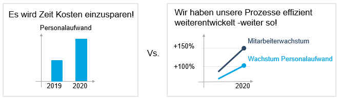
In order not to leave the interpretation of the data to chance, a Context are added to the data. It is important that the figure is also put into relation visually. Describe the path of your protagonist/your key figure. Has your protagonist grown or declined compared to its past? What might have been obstacles to growth? How will it develop in the future? Or how does it compare to another key figure?
Focus on the setup and the core message: Do you want to emphasize the temporary trend? Or a long-term trend? Is the comparison with the previous year/previous month perhaps not as important as the comparison with another key figure? For example, have personnel expenses doubled compared to the previous year while the number of employees has tripled? If you only make a comparison with the previous year, the key message would probably be: it's time to cut costs. But if you put this in relation to employee growth, the key message is more likely to be: We have developed our processes efficiently - keep it up.
The core statement
And the moral of the story? Of course, this has already been determined in the setup and the chart, the protagonist and the context have been chosen accordingly, so that your statement is already supported by the data visualization.
At the end of the day, you not only want your listener to remember your story and be able to reproduce it, but also to derive appropriate measures/options for action from it. For example, it's great if we can tell the fairy tale of Snow White and the Seven Dwarfs true to the original. However, if the moral of the story remains hidden from us - namely not to fall for the youth and beauty craze like the evil queen - the fairy tale has missed its purpose.
Do you have a Static data visualization such as in a PowerPoint, where a snapshot of the data is shown at a certain point in time, you can, for example, use the Title of your slides yours Recommendation for action insert. This could read: We must continue to expect a doubling of personnel expenses in the budget planning if we also expect a tripling of the number of employees in the coming year.
With the explorative data visualization For example, in a dashboard that is regularly filled with current figures, there may be different lessons that you want to convey at different times. If the "keep it simple" approach allows it, a call to action can also be integrated here as a subtitle, for example. However, the additional text on such a dashboard is often rather misleading and if it is not regularly updated according to the data situation, it can even contain false statements. Therefore, it is better for exploratory data visualizations if they convey the recommendation for action through an appropriate choice of shapes, colors, key figures and context. implicit include.
Our tip
Even as an adult and business analyst, I don't have to do without storytelling - on the contrary, I can use stories to convince and inspire my audience with data.
Data visualization: recognizing correlations and making data usable interactively
Source: Cole, Nussbaumer, Knaflic (2015): Storytelling with Data: A Data Visualization Guide for Business Professionals. Hoboken, New Jersey: John Wiley & Sons, Inc.
Further links and literature:
- Theory of layout design: https://de.wikipedia.org/wiki/Gestaltpsychologie#Berliner_Schule_der_Gestaltpsychologie_(Gestalttheorie)
- Formatting of charts:
Wong, Dona M. (2013): Guide to Information Graphics. The dos & don'ts of presenting data, facts and figures. New York, London: W. W. Norton & Company Inc. - Storytelling: