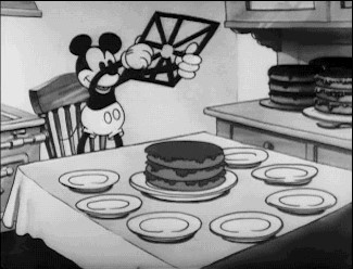
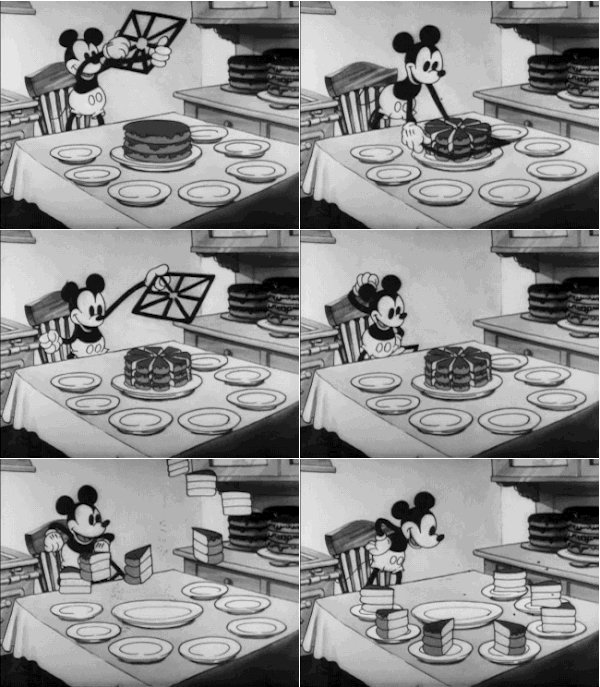
But if you take a closer look at Micky's table, you will notice that the cut shape consists of eight pieces - but there are only seven small plates on the table. Just as this picture leaves us with a rather deceptive impression when we look at it more closely, we also have to be careful when using cake diagrams.
That's why we have put together three tips for working with pie charts below.
Tip 1: Use a pie chart for data visualization only to show the rough breakdown of a whole
When it comes to rough division then you are exactly right with the pie chart. Let's assume we want to divide the sales revenue of our company according to Disney characters. At the bottom of the pie chart, we immediately see that there are a large piecenamely Mickey Mouse. The second largest piece stands out Donald Duck. And the rest is somehow distributed among Mickey's and Donald's friends. Even if you want to know, for example, what the combined sales share of Donald, Daisy and Scrooge is, you can roughly estimate this using the pie chart.
But can you also recognize with the naked eye whether Pluto or Tick has more sales revenue? And what percentage of sales would Pluto and Tick account for if they pooled their shares? No? Me neither. The bar chart is much better suited to precisely such questions.
| Pie chart | 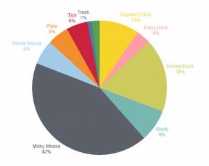 | → for rough division of a whole |
| Bar chart | 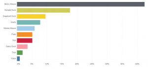 | → for exact sizes, mapping of rankings and listing of individual elements |
Figure 2: Comparison of pie chart vs. bar chart; source: own illustration
Now you could say, well, then I'll just sort the pie chart not alphabetically, but by percentage of sales. But even then, the question remains: Can you see with the naked eye exactly what percentage, for example, two characters together make up of the whole?
Another advantage of the bar chart is that even the smallest elements, such as Trick, can be found directly. As each character or element has a line, there is no scramble for space to label the pieces of the pie outside the circle. So if even the smallest pieces are important to you, then I advise you to use the bar chart.
 | Incidentally, the problem with the pie chart lies in the Angles. With the naked eye we can see these do not assess well. Some people have problems hanging a picture horizontally, i.e. at a 90° angle, on the wall. Just as we are not good at estimating angles, the same applies to the circumference of a circle. Therefore - as tempting as it may sound, it's better to use no donut charts. Here our optical perception problem is even greater than with the cake and the angles. |
Tip 2: Use as few different colors as possible
The more pie slices your pie chart has, the more difficult the topic of colors becomes. Sometimes the users of the chart are already very conditioned to a certain color scaling (1).
 | A Principle for every data visualization should be: Less is more. |
The use of color in data visualization is normally used to highlight differences. However, the fact that we are talking about ten different Disney characters could be seen very clearly without the use of color. The chart itself is sufficient for this (2). Without color, however, it is difficult to tell which piece of cake the labels belong to.
|
(1) Customized coloring: 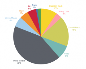 |
(2) No coloring: 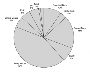 |
|
(3) One color with light/dark shading: 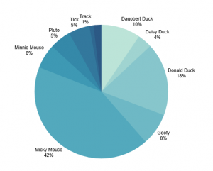 |
(4) My recommendation: fewer pieces of cake, clearer differentiation of light/dark shading 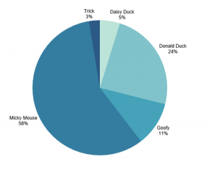 |
Figure 3: Coloring of pie charts; Source: own illustration
That's why a little color in the pie chart is useful. However, it is best to choose a base color and then use the different shades of light and dark (3). This also has the advantage that color-blind people can read the diagrams more easily.
However, with as many pieces of cake as we have Disney figures, it is difficult to clearly distinguish the colors from each other. Unfortunately, there is no ideal solution for our case in terms of color selection.
But we don't have to give up completely. If possible, reduce the number of pieces of cake you eat. A maximum of 5 pieces of cake should have the same color (4).
Tip 3: Define and highlight a key message before visualizing the data
Define a Key message and a recommendation for action and emphasize your core statement in your pie chart. But the same applies again: Less is more. By pre-formulating a core statement and a recommendation for action, I can prevent misinterpretations of data. Because as a layperson, I don't know what to do with the statement I can read below: "Mickey Mouse had a 42% share of sales in the 2021 financial year". Is 42 percent good or bad?
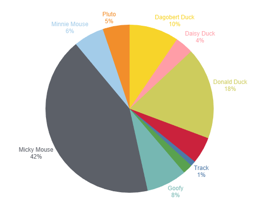 Figure 4: Distribution of sales in Duckburg; source: own illustration
But what fact would I like to emphasize in the distribution of sales by Disney character? What is my interpretation as an expert on the figures? In short: What is my key message?
As a Disney expert, I know that there are characters who live in Duckburg and are ducks. And the others are not ducks. My company's goal could be to increase sales with ducks in the 2021 financial year.
My core message and recommendation for action could therefore be:
- Key messageThe proportion of sales we have made with ducks so far this financial year is around 39 percent. We still need to reach our goal of a 50:50 split between ducks and non-ducks 11 percent share of sales.
- Recommendation for actionIn order to further increase sales of ducks, we need to invest more in sales activities for our ducks in the remainder of the financial year.
We need a sales offensive for ducks in order to achieve our 2021 sales target:
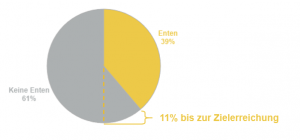 Figure 5: Sales campaign for ducks to achieve the 2021 sales target; source: own illustration
If you now write your recommended action in bold letters, you may even have triggered an action at the end with your simple pie chart.
In any case, you can be sure that your core message has reached the user and that there will be fewer misinterpretations of your data visualization.
You can also find out more about misinterpretations in the article by Jennifer Münch "The fine art of data manipulation".
The good old pie chart is far from obsolete. And by taking three small tips into account, you can realize the potential of the pie chart for your Data visualization to take advantage of this:
- Use the pie chart only to visualize the rough division of a whole.
- Less is more: Use colors and pieces of cake sparingly.
- Before you visualize, think about your key message and recommended action.
Read our guide to successful data visualization here