The influence of AI opens up completely new possibilities: AI-powered tools are revolutionizing how we understand and use data. In this article, we take a look at the latest developments and show how established and innovative tools help to generate and visualize KPIs more effectively.
Tableau: The next generation of data visualization
Pulse
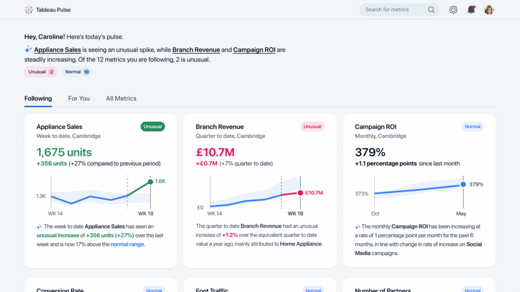
Pulse integrates fully generative AI and analytics capabilities that revolutionize the way data is handled. With the Insights generator it offers a newsfeed-like overview of key figures, with detected changes and trends formulated in natural language and provided with suitable visualizations. One outstanding feature is the new Metric Layer-concept, which enables a uniform definition of key figures across the entire organization. This automatically generates a newsfeed-style overview.
Further highlights of Tableau Pulse:
- Setting options for a more detailed analysis, e.g. whether a value falls, rises or remains neutral.
- Various Insight types to choose from, such as:
- Risky Monopoly: Indicates when a few dimension members make up the majority of the contribution to a metric.
- Top DetractorsIdentifies members that have developed in the opposite direction to the observed change in the metric.
- Included in the Tableau Creator license (75 €/month)
However, there is currently no function for the automated creation of dashboards or diagrams. It should also be mentioned that a wildcard filter option does not yet exist in Pulse.
Einstein
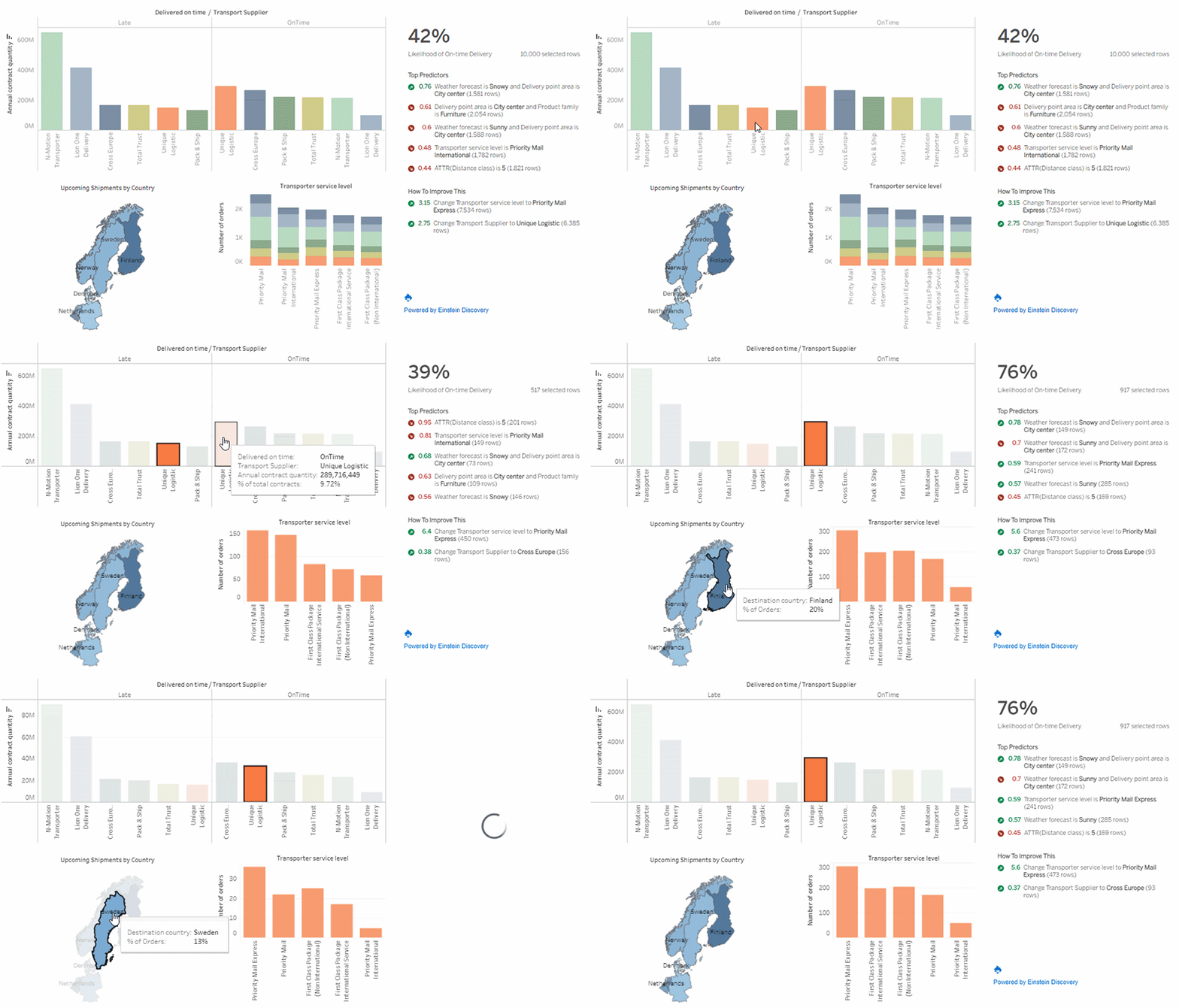
Einstein is a Salesforce AI technology designed to act as a data scientist. It provides machine-learning-supported insights and recommendations for action directly in Tableau. It recognizes statistically relevant patterns and reveals essential information from the data, such as predictions about customer purchasing behaviour. It also assists in the creation of dashboards by providing guidance on Tableau functions and complex analytical expressions in natural language and supports data exploration.
Other key features of Tableau Einstein:
- Forecast models can without code be created.
- Encrypted processing of company data ensures security.
- Automated code generation (Apex Code) for Salesforce applications.
- Not included in the Tableau Creator licenseadditional license required:
Salesforce CRM Analytics (€165/month) or Einstein Predictions license (€75/month)
Microsoft - Power BI: The AI co-pilot for your KPIs
Key Influencers
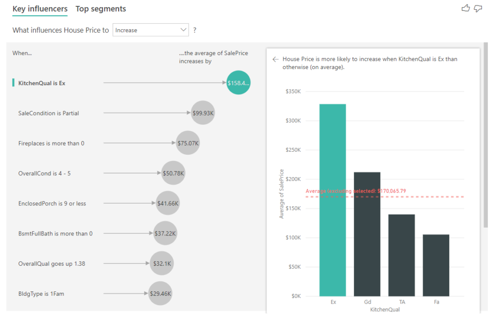
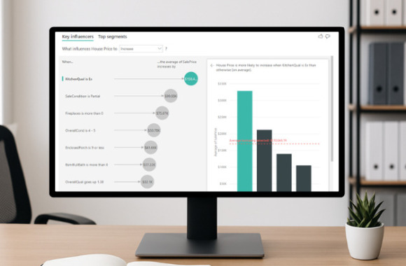
Key Influencers is a function that makes it easier to understand data. Power BI analyzes data and creates a ranking of factors influencing the metric. The result is presented in two tabs:
The "Key Influencer Tab" shows critical causes for the metric and provides visualizations and explanations for each.
The "Top Segments Tab" lists the segments that have the greatest influence on the metric, for example long-standing customers of a particular product.
Further information on Power BI's Key Influencer:
- Suitable for finding factors that affect the metric
(e.g.: What influences staff turnover?) or - to obtain a comparison of the relative importance of the factors
(Do short-term contracts have a greater impact on fluctuation than long-term contracts?) - No processing of questions possible
- Included in all Power BI licenses (Pro 9.40 €/Premium 18.70 €/month)
Distribution
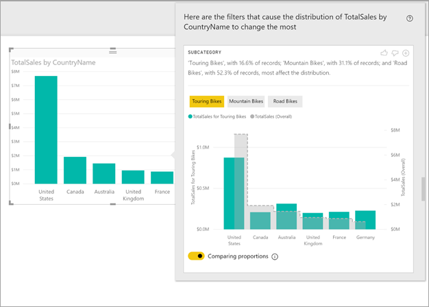
By right-clicking on an existing chart and selecting "Analyze Data", Power BI can analyze the reasons for High or low points and analyze the distribution of the data. The automatically generated visualization enables simple interpretation (e.g. how high the specific proportions of the diagram are, why sales are lower in area x, etc.).
Further information on Power BI's Distribution feature:
- No processing of naturally formulated questions
- Included in all Power BI licenses
Q&A Visual
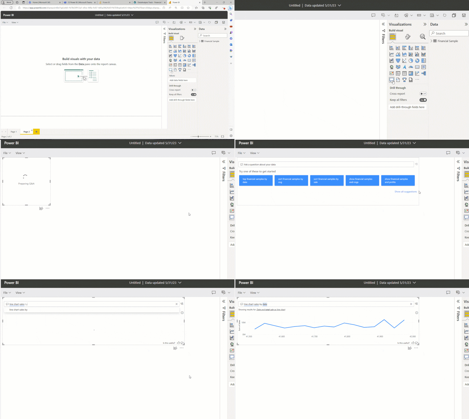
The Q&A visual function enables the Entering questions or selecting from a suggested list. Power BI outputs matching data sets and visualizations depending on matching database information, with modifications possible for more precise results. Users can also specify the desired visualization form (line chart, table, map form, maps, matrices).
Further information on "Q&A Visual":
- Answer currently in English only
- Multiple questions at once not possible
- Included in all Power BI licenses
Copilot
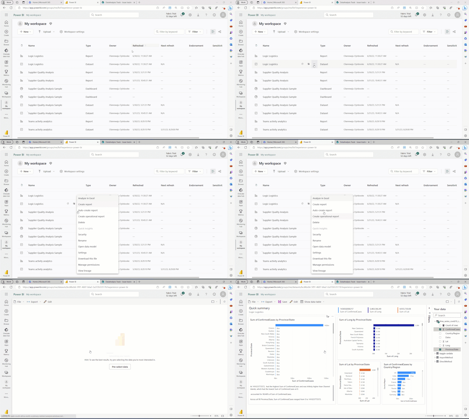
Microsoft's Copilot is based on the technology of OpenAI's GPT-4 and offers the possibility to, automatically analyze data and a complete report (dashboard) from an existing data set. In addition, Copilot can create content and Propose elements for the reportconcrete visual elements on request and even a Smart Narrative Visual that summarizes important insights or creates recommendations for action within a dashboard, for example.
Further information about Microsoft Copilot:
- Copilot can no longer customize generated visual elements
- No automated layout changes and adding Filter possible
- Complex intentions are not understood (e.g.: "Generate a report that shows incidents by team, type and owner for only 30 days.")
- Only included in Microsoft Fabric (4675.60 €/month for the entire organization)
Copilot for Microsoft 365 - Excel
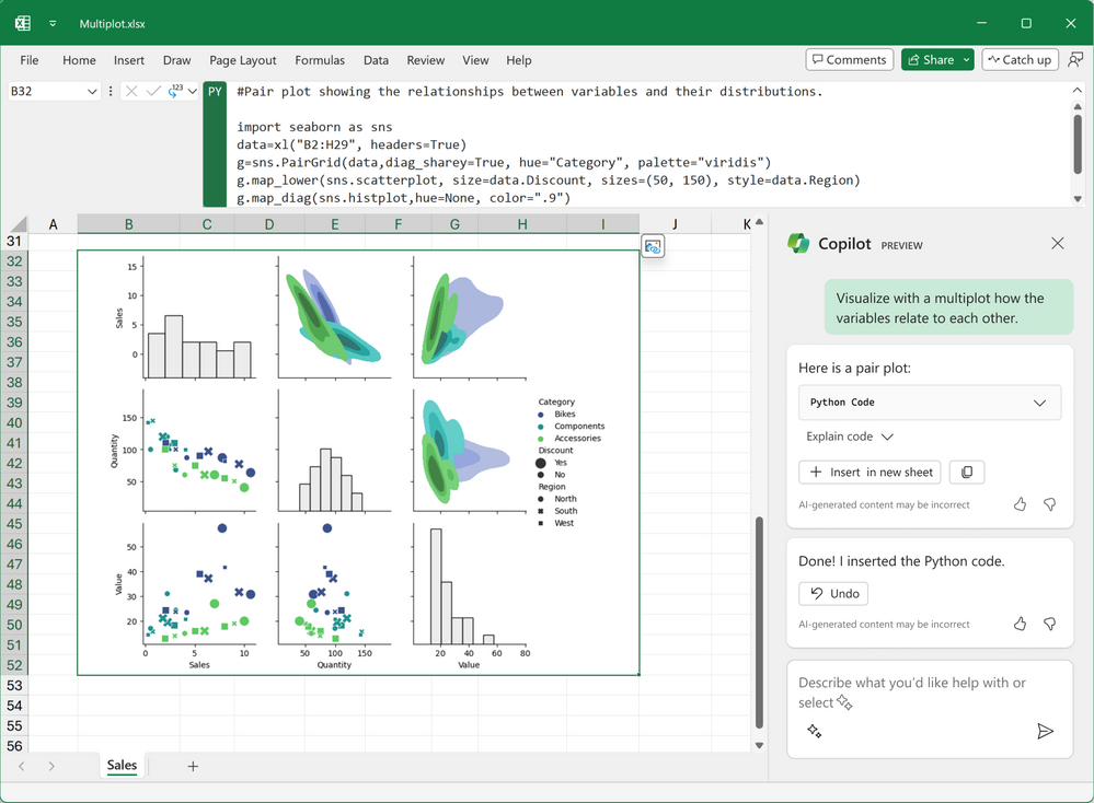
Although Excel is primarily known as a spreadsheet program, it still offers some AI features that can make our everyday work easier.
Excel offers a AI-supported chat functionwhich helps to analyze data sets, reveals insights and trends and automatically answers questions and follow-up questions. It is possible to make automated adjustments to time spans, columns and rows and to create suitable charts that can be customized as required.
Microsoft's Copilot for Microsoft 365 is available in addition to the Microsoft 365 plan for €28.10/month.
The role of storytelling in data visualization
Storytelling is crucial in data visualization, as it prevents data from being presented only as numbers. A dashboard should follow a common thread in order to present data in an understandable and exciting way.
Unfortunately, Tableau and Power BI do not have explicit storytelling functions, but they do help to present data effectively. Tableau Pulse and Power BI's Key Insight reports use a narrative structure to illustrate the core message of the data. For example, they show how certain sales figures are generated or why values change.
The chat functions of these platforms enable a deeper analysis and help to understand which visualizations are most suitable. Microsoft Copilot can also suggest and create suitable and vivid visualizations, which can significantly support the data storytelling process.
KPI generators
The selection of relevant KPIs is crucial in order to create meaningful dashboards. This process takes time, a deep understanding of data and experienced analysts. It is also important to be clearly aligned with the company's goals and strategies. Here we present AI tools that make this process easier:
Clickup and Taskade:
These project and task management platforms use AI to suggest relevant KPIs. Users can make entries via chat or select from ready-made templates. It is also possible to find meaningful KPIs based on historical data.
ChatGPT
With ChatGPT can suggest relevant KPIs and use cases based on textual prompts and rank them according to individual criteria. It can customize KPIs and offers advanced features to create appropriate visualizations using Chat-GPT4. CustomGPTs enable customization to specific company needs and the use of internal data, which can save time and resources in the long term.
Conclusion
Platforms such as Tableau and Power BI offer great support in the data visualization process through the new AI-supported analysis and visualization features, while KPI generators such as ClickUp, Taskade and ChatGPT can facilitate the process of KPI selection.
Although these tools are not yet able to implement all visualization requirements, they make a significant contribution to simplifying the use of data visualization tools. This opens up the possibility for companies to effectively analyse and visualize data without extensive programming or expert knowledge.
The continuous development of AI functions such as Power BI's Copilot and Tableau Pulse promises exciting developments, especially in the automatic creation and design assistance of dashboards.
This blog post was originally written by Hue Bgoc Jasmin.