Once upon a time there were three manufacturers of business intelligence tools: Qlik, Tableau and Microsoft. Between 1993 and 2013, these three launched business intelligence tools on the market, each ten years apart. Qlik made the start in 1993 with its product QlikView. This was followed by Tableau in 2003 with its product of the same name, and finally Microsoft launched a modern business intelligence tool called Power BI in 2013.
All three manufacturers and tools had one goal in common: the Data exploration, analysis and Visualization should be as simple as possible. The average consumer without special IT or programming skills should be able to analyze and visualize their data themselves in order to derive maximum added value from their own data.
The rise to the Business Intelligence Leaders in Gartner's magic quadrant
In the Gartner's magic quadrants for analytics and business intelligence platforms Over the years, these three manufacturers have risen to become the Leaders up. And while there were still many providers at the top until 2015, the trio even positioned themselves as the sole leaders for analytics and business intelligence platforms between 2016 and 2018.
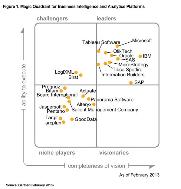
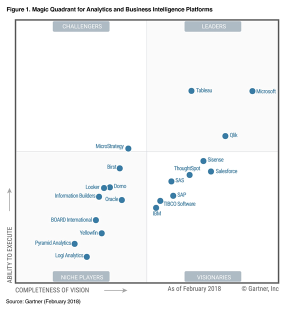
Each year, all three manufacturers have to face up to their competitors in the disciplines of analysis and content creation, sharing of findings, infrastructure, data management and overarching platform functions.
The Viz Wiz operating principle
But how does the whole miracle work? Quite simply, always according to the Viz Wiz principle. A Visualization Wizzard uses a desktop application to integrate a wide variety of data sources. to. These can be servers, databases, files, online content and much more. He connects these sources in the application and can thus create dashboards with a wide variety of diagrams. These Dashboards are then published to a server or directly to the webto share the generated information with other users. Of course, the whole thing also works on mobile devices.
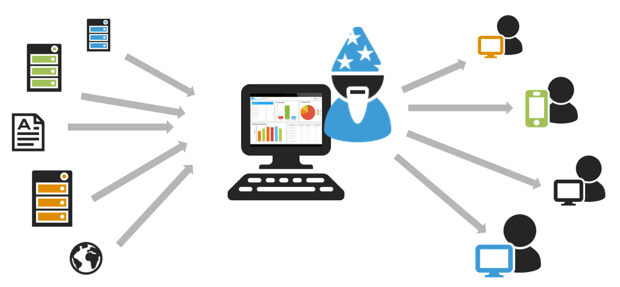
Source: Own representation
QlikView, Power BI and Tableau offer a real Large number of standardized interfacesto tap into data sources. Qlik is currently the front runner here with a total of 115 interfaces, followed by Microsoft with 81 interfaces and Tableau with 54 interfaces. It is therefore always worth taking another look at the connectors offered by the respective manufacturer.
The leader qualities of Tableau, Qlik and Power BI in detail
Qlik offers a variety of data connectors as well as a Data preparation using your own scripting language on. This can be an extremely powerful tool for those who are proficient in this language. For some less IT-savvy users, however, this type of data integration is a "miracle of nature" in itself.
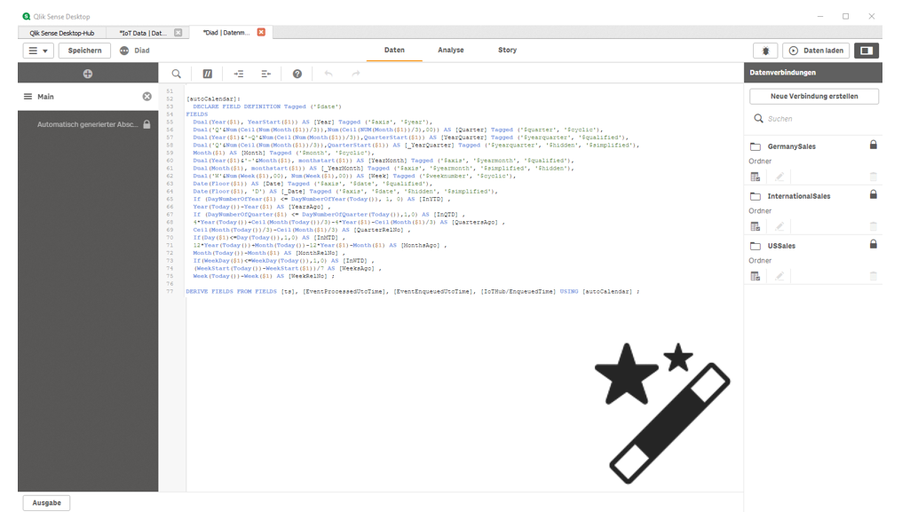
Source: Own screenshot from Qlik Sense Desktop
The latest marvel from Tableau is Tableau Prep. Here the manufacturer finally offers a distinctive ETL function with the help of which kModeling omplicated workflows for data preparation and can also be automated using Tableau Server and the Tableau Prep Conductor component.
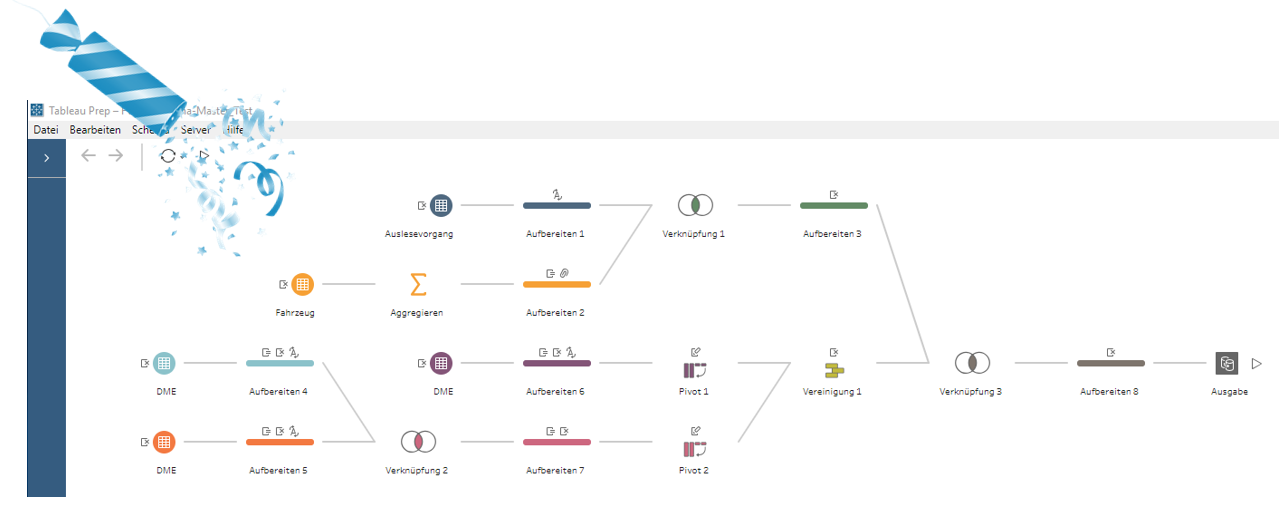
Source: Own screenshot of a Tableau Prep workflow
Microsoft is also attacking with Power BI and is currently the only one of the three manufacturers to offer a Streaming function which is used to supply dashboards with real-time data. Here, the data import happens as if by magic.
Qlik Sense is a tool that could be described as the princess of history. It is user-friendly, easy to learn and pretty to look at.
You are currently viewing a placeholder content from YouTube. To access the actual content, click the button below. Please note that doing so will share data with third-party providers.
Source: Own workflow from Qlik Sense
As far as the visual aspect is concerned Power BI already offers significantly more functionality than Qlik Sense. Nevertheless, it is easy to use as it follows a similar logic to other Microsoft products such as Excel.
While you can immerse yourself in the visualization logic of Tableau first, Tableau is certainly the best way to get to grips with the Queen of visualization. Almost anything is possible here, and there are virtually no limits to the imagination. Tableau puts the crown on the visualization, so to speak.
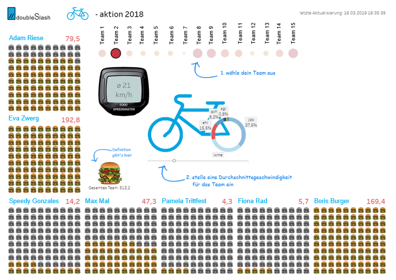
Source: Own screenshot from Tableau Desktop
"Swarm on the earth and multiply on it" (Genesis 9:7). True to this biblical quote one of the essential functions of the three tools is that dashboards are distributed and knowledge is increased can be created. If you want to share your dashboard, the easiest way to do this is with Power BI. Simply publish it from the Power BI desktop application and then share it online using the email sharing function - and you'll be swarming with clicks.
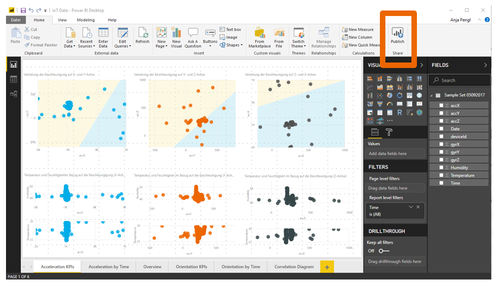
Source: Eigner screenshot from Power BI Desktop
With Qlik and Power BI, creating dashboards is free. Simply download and install the software on your PC and you can start dashboarding. Only when it comes to publishing and distributing or sharing on a larger scale does the whole thing become chargeable. Unfortunately, Tableau does not offer a free desktop application (except for students). If you want to create dashboards on the desktop with Tableau, you have to purchase licenses in the traditional way.

And the moral of the story ....
This means that nothing stands in the way of data visualization. Anyone can now start visualizing the Gold in his data easily with a BI tool of his choice to lift. If necessary, of course, always with the friendly support of his favourite visualization wizard.

And if they haven't died, they are still visualizing today ...
THE END.
Fancy more data visualization with BI? This way ...