In this blog post, we'll show you which chart types are available to you in Confluence and how you can best use them to visualize your data. If you want to know how to visualize your data effectively, you've come to the right place. And don't worry if you want to create a specific chart type yourself: We've got step-by-step instructions for that too.
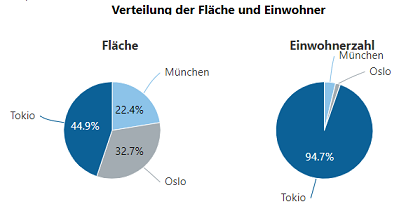
The "Create diagram from table" macro is used to create a diagram directly from the data in a table in Confluence.
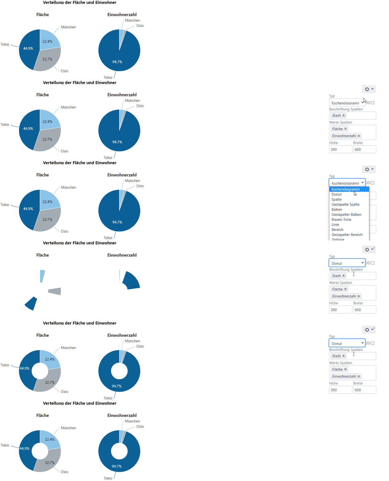
Example of two pie charts from the same table:
What types of diagrams are available in Confluence?
Data visualization in Confluence includes a range of chart types, including pie charts, bar charts and line charts, which are suitable for different use cases:
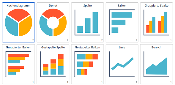
After a diagram has been created, you can "quickly" change the diagram type on the Confluence view page and, for example, turn a pie chart into a donut chart (if you activate this menu):
It should only be noted that some diagrams require certain data and therefore not every conversion is possible (e.g. Gantt chart).
Which diagrams are particularly suitable for which use case?
Gantt chart as an overview of specific time periods
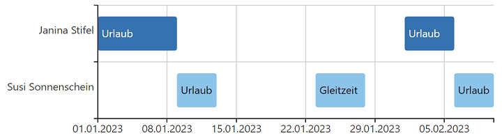
The Gantt chart is suitable for the clear presentation of vacations and absences of colleagues. The minimum input required for such a diagram is the start and end date and a project name/employee name/label. The practical thing here is that each employee can enter their vacation in their personal Confluence area and the vacations of each team member can then be displayed in aggregated form on the team page:
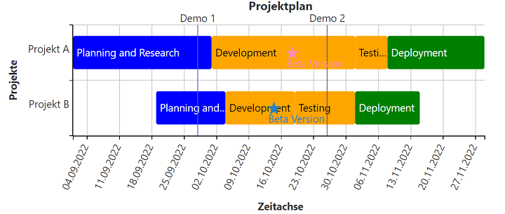
The Gantt chart is also suitable for displaying the phases of a project:
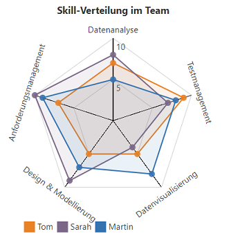
Radar diagram as skill matrix
A radar chart can be used to show the current level of knowledge of team members in certain areas. This makes it easy to see who is an expert in which area and who you can turn to if you have any questions:
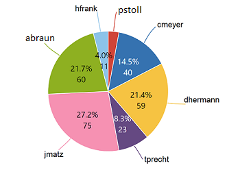
Pie chart for the distribution of training points
This diagram can be particularly useful for clearly displaying distributions, such as training and development points among team members:
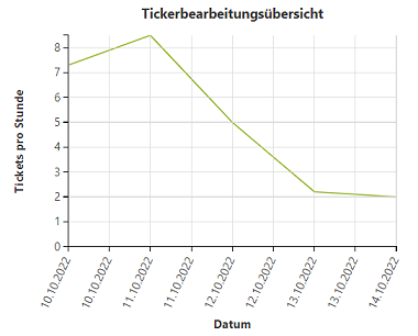
Timeline chart as a productivity indicator
With the timeline diagram, you can clearly see how productive you were on a particular day and how many tickets or similar were processed:
What options are there for working with tables?
Filter tables
Filters can also be created for tables in Confluence. You can select different columns as filter values and the table only displays the corresponding rows after you have entered values. The filtered data is not lost, but can be restored by resetting the filter. The practical thing is that the corresponding diagram then also adapts directly.
Example: In the original table there are companies A-F. A filter option would be e.g. "only companies from the healthcare sector" or "only companies with more than 100 employees" etc.
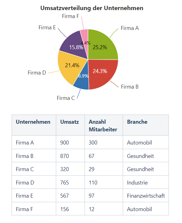
This is what the filter selection option looks like:

Here you can filter by "Turnover" or "Industry". This can be set individually.
Pivot table
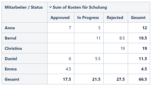
Pivot tables are a special type of table that offer the option of displaying and evaluating data from a table in different ways without having to change the original data or table. The benefit lies in reducing large amounts of data to manageable sizes or preparing data for corresponding diagrams.
This is what the table looks like:
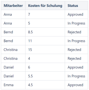
And so the pivot table:
Merge tables
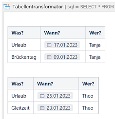
The "Merge tables" macro offers the option of merging two or more tables into one. This was also used above for the Gantt chart for vacation planning.
This is what it looks like on the editing page:
And so the merged table on the Confluence page:
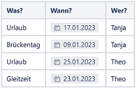
Table Spreadsheet
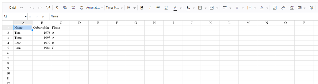
This macro is called "Table Spreadsheet" and looks similar to an Excel spreadsheet. It is integrated directly on the Confluence page and offers many functions (formulas, filters, etc.). It can be used as a "one source of truth", for example.
This is what it looks like:
The most common functions are
- Format cells
- Apply formulas
- Format text (font, size, color, etc.)
- Use multiple sheets
- Export to CSV, XLSX
- Import from Excel (xlsx, csv, ods format)
Create tables directly from JSON / CSV files
In Confluence, tables can be created directly from JSON or CSV files. All you need to do is use a macro.
Conclusion
In conclusion, it can be said that the Data visualization in Confluence is an effective and user-friendly method of visualizing complex data sets in an understandable way. With a variety of available diagram types and flexible table functions, Confluence enables a high degree of customizability that is suitable for various use cases. Whether it's planning projects with a Gantt chart, displaying skill matrices using radar charts or filtering table data - Confluence offers a suitable solution for every scenario. Data visualization in Confluence not only contributes to improved team communication, but can also provide valuable insights for data-driven decision-making processes.
Learn more about data visualization